Why Cover Designers Want Your Title to Be as Short as Possible (unlike this one)
April 8, 2017 by H. O. Charles in category Art, Cover, Design by H. O. Charles tagged as art, covers, designI’ll let you into a little secret: wordy titles (and also looong author names, if I’m honest) are HARD WORK for a cover designer. Really, we should be charging extra for them. Perhaps £10 extra per letter for any word more than one syllable long would be sufficient. The Curious Incident of the Dog in the Night-Time would have netted me £380 before I’d even started doing any art…
* laughs dreamily *
I joke, of course, but if you are into art and design, and you recognise that a reader will judge a cover before they judge a title, then you might start to see how less is more…
Here’s a worked example (very hastily put together, I should add), but hopefully it will show you how a short title (and even author name) can help you achieve that impactful, minimalist look.
The first cover is simple, no-fuss and easy to read. The text doesn’t have to be huge, and I can keep everything neatly squared.

If I want to go for a really modern approach, I can blur out the background entirely, which gives the title text much more weight, and gives me the freedom move the author name about. I can even play with light. Of course, this would work better with a more recognisable image than a Chinese archway, but you get the general idea…

Then we have a longer author name. The colours I can use for it are now more limited if I want it to remain legible, and it needs balancing out with some text at the bottom. Still, it looks fine because the most important piece of text (the title in this case – Andy Pantaloons is not that famous) is short.

Things are getting tricky with this longer title! At this point, I would usually change the font and tweak the letter spacings to see if it would look better, but for the purposes of explaining the impact of title length, I’ve left it the same. It’s still just about okay, but if the author wants more images, the chances are they will fight for attention with the text.

Time to pack my bag and go home! What a mess! There is just too much image for a title that size, and so I would either consider getting rid of the arch altogether, or throwing my laptop against the wall.

Of course, it is down to the designer to take whatever title you throw at them and make it look good, and we have a tonne of tricks for doing that, but if you like the minimalist look, and you want your cover to appear modern, AND there is an idea you want to convey in pictures, then consider a short title paired with a single, powerful image. This is one of my favourite examples from another designer (Eric White):

All of that said, here’s how a long title can look good. This cover is by Ervin Serrano, who did a brilliant job with the “The Invention of Murder: How the Victorians Revelled in Death and Detection and Created Modern Crime” but you can see how he had to sacrifice images (almost) altogether in order to make the overall design work and remain clear.

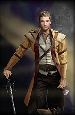
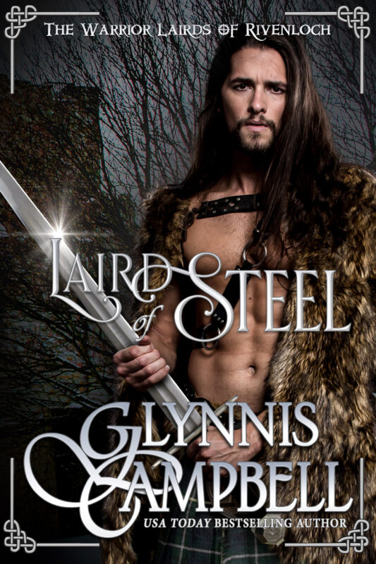
And of course, certain genres *demand* busy artwork, so I’ll neatly lever my most recent fantasy cover design in here, and thank you for reading!

 H.O .Charles, a cover designer and author, was born in Northern England, but now resides in a beige house in Suffolk.
Charles has spent many years at various academic institutions, and really ought to get on with writing a PhD, but frequently becomes distracted by writing fantasy fiction instead.
Hobbies include being in the sea, being by the sea and eating things that come out of the sea.
Cover designs: www.hadleighdesign.blogspot.com
Author: www.hocharles.com
2 0 Read moreFeatured Books


THE ULTIMATE BETRAYAL
To prove her father’s innocence, she’ll have to turn a killer's sights on herself.
More info →


MIDNIGHT MADNESS
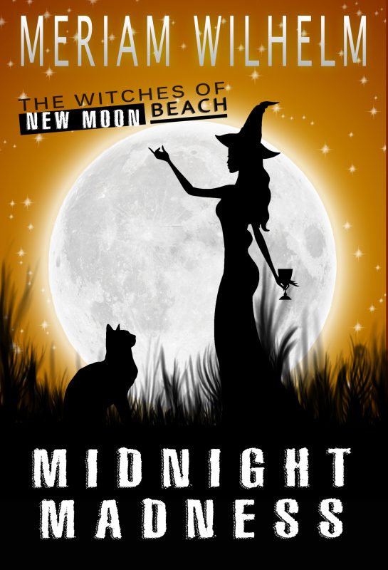
As if Olivia Merriman doesn’t have enough to do in her beloved town of New Moon Beach, now her grouchy great-grandmother has recruited her to head up their coven of witches; her sisters are miffed, the coven is pushing her to accept the job, and to top it all off an evil wizard is messing with her love life.
More info →