THE WRITER BEHIND THE COVERS
October 3, 2007 by A Slice of Orange in category ArchivesWith the start of my psychic triplets trilogy for Avon, cover design suggestions and ideas are uppermost on my mind. While AT THE EDGE (Claire’s story) has a very sexy cover, not my usual “cover look,†it had an unexpected result: it drew new readers, (a good thing). The second book, A STRANGER’S TOUCH (Tempest’s story), an April 2008 release, has yet another look because the heroines’ gifts are very unique. (Watch for Leona’s untitled story 11/08.)
I was an artist in a former life, and regularly give input on my covers and titles now. (I’ve generated about 95% of my titles.) When I turn in a manuscript, I also usually turn in background research, a cover suggestion file, or ideas for titles. However, the title and the cover ideas are often requested in advance of the finished manuscript. My foreign covers are generally good without consultation. And the days of the “stepback†cover may be ending, because they are quite expensive, but I have had some gorgeous ones in my historical books.
Silhouette’s packaging of the TALLCHIEF 9-book series had much of my input. I not only developed the logo, but the genealogy chart, and look of the legends within the books. (Little did I know that in author-driven miniseries writers did not usually send in a composite of all packaging ideas, plus the storylines of all five books.) In one book I wrote about my own 3-stone garnet ring and it was used for the cover of TALLCHIEF CELEBRATION. The original cover of TALLCHIEF FOR KEEPS, a single title, was pale and very fairy tale-like, not representative of the Native American/Scottish heritage. Very seldom is the cover changed, but I made my statements, referring to the file I had sent with that manuscript. Pale-blended covers do not copy well in black and white, which is how they are often marketed in magazines. (Tip: Take a pale or very dark cover to a copy machine and study the results.) My editor worked very hard to change that pale cover into a smashing red one with a collage of a white feather, flower and locket. The locket does not resemble the one my father gave my mother when they were sweethearts, but the heart shape was perfect for the collage. Writers use their life experiences and they make handy elements for covers, too.
As for my covers at Avon, I am often consulted about the title, cover and the back blurb. The cover of THREE KISSES, an Avon release, has my neighbor’s western boots. (My neighbors have now grown used to odd requests.) I sent photos of the boots and was surprised when they were used without changes. “Seafoam†is my favorite color, and was used in FLASHBACK, set on the Oregon coast; I was consulted about the model’s face. HIDDEN SECRETS is set in Snoqualmie Pass, Washington state, where I spent college summer/winter breaks working as a waitress. The background of the cover is the pass at I-90. WITH HER LAST BREATH has a striking wraparound cover; SILENCE THE WHISPERS has an eerie look, and is perhaps one of my favorite stories.
**************
 A USA Today bestseller and international author, Cait London‘s books have been featured alternates in Doubleday and Rhapsody book clubs, and featured selection in romantic suspense in Mystery Guild book club. Her awards include Holt, Laurel Wreath, RIO (Reviewers International Organization), Bookseller’s Best, WRWA Reader’s Award for Single Title, B.Dalton’s Bestseller Award, several RT nominations and awards, including Reviewer’s Choice Award
Read more of Cait’s comments on the cover approval “benchmark†in the October issue of the Orange Blossom, “The Writer Behind the Covers.†Visit http://caitlondon.com/ for news of Cait’s upcoming books, her writer’s tips section, and her blog, Daily or Not, for more insights into a career writer’s life and experiences.
Affiliate Links
A Slice of Orange is an affiliate with some of the booksellers listed on this website, including Barnes & Nobel, Books A Million, iBooks, Kobo, and Smashwords. This means A Slice of Orange may earn a small advertising fee from sales made through the links used on this website. There are reminders of these affiliate links on the pages for individual books.
Search A Slice of Orange
Find a Column
Archives
Featured Books
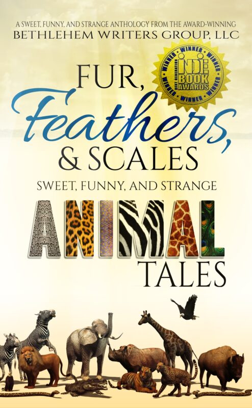
FUR, FEATHERS AND SCALES: Sweet, Funny, and Strange Animal Tales
So cuddle up with your favorite pet-real or imaginary. No matter. You'll find just the right story to share.
More info →THE CHRISTMAS WISH
Will Eve find it’s possible that Christmas wishes aren’t only for little girls?
More info →Contributing Authors
Search A Slice of Orange
Find a Column
Archives
Authors in the Bookstore
- A. E. Decker
- A. J. Scudiere
- A.J. Sidransky
- A.M. Roark
- Abby Collette
- Alanna Lucus
- Albert Marrin
- Alice Duncan
- Alina K. Field
- Alison Green Myers
- Andi Lawrencovna
- Andrew C Raiford
- Angela Pryce
- Aviva Vaughn
- Barbara Ankrum
- Bethlehem Writers Group, LLC
- Carol L. Wright
- Celeste Barclay
- Christina Alexandra
- Christopher D. Ochs
- Claire Davon
- Claire Naden
- Courtnee Turner Hoyle
- Courtney Annicchiarico
- D. Lieber
- Daniel V. Meier Jr.
- Debra Dixon
- Debra H. Goldstein
- Debra Holland
- Dee Ann Palmer
- Denise M. Colby
- Diane Benefiel
- Diane Sismour
- Dianna Sinovic
- DT Krippene
- E.B. Dawson
- Emilie Dallaire
- Emily Brightwell
- Emily PW Murphy
- Fae Rowen
- Faith L. Justice
- Frances Amati
- Geralyn Corcillo
- Glynnis Campbell
- Greg Jolley
- H. O. Charles
- Jaclyn Roché
- Jacqueline Diamond
- Janet Lynn and Will Zeilinger
- Jaya Mehta
- Jeannine Atkins
- Jeff Baird
- Jenna Barwin
- Jenne Kern
- Jennifer D. Bokal
- Jennifer Lyon
- Jerome W. McFadden
- Jill Piscitello
- Jina Bacarr
- Jo A. Hiestand
- Jodi Bogert
- Jolina Petersheim
- Jonathan Maberry
- Joy Allyson
- Judy Duarte
- Justin Murphy
- Justine Davis
- Kat Martin
- Kidd Wadsworth
- Kitty Bucholtz
- Kristy Tate
- Larry Deibert
- Larry Hamilton
- Laura Drake
- Laurie Stevens
- Leslie Knowles
- Li-Ying Lundquist
- Linda Carroll-Bradd
- Linda Lappin
- Linda McLaughlin
- Linda O. Johnston
- Lisa Preston
- Lolo Paige
- Loran Holt
- Lynette M. Burrows
- Lyssa Kay Adams
- Madeline Ash
- Margarita Engle
- Marguerite Quantaine
- Marianne H. Donley
- Mary Castillo
- Maureen Klovers
- Megan Haskell
- Melanie Waterbury
- Melisa Rivero
- Melissa Chambers
- Melodie Winawer
- Meriam Wilhelm
- Mikel J. Wilson
- Mindy Neff
- Monica McCabe
- Nancy Brashear
- Neetu Malik
- Nikki Prince
- Once Upon Anthologies
- Paula Gail Benson
- Penny Reid
- Peter J Barbour
- Priscilla Oliveras
- R. H. Kohno
- Rachel Hailey
- Ralph Hieb
- Ramcy Diek
- Ransom Stephens
- Rebecca Forster
- Renae Wrich
- Roxy Matthews
- Ryder Hunte Clancy
- Sally Paradysz
- Sheila Colón-Bagley
- Simone de Muñoz
- Sophie Barnes
- Susan Kaye Quinn
- Susan Lynn Meyer
- Susan Squires
- T. D. Fox
- Tara C. Allred
- Tara Lain
- Tari Lynn Jewett
- Terri Osburn
- Tracy Reed
- Vera Jane Cook
- Vicki Crum
- Writing Something Romantic
Affiliate Links
A Slice of Orange is an affiliate with some of the booksellers listed on this website, including Barnes & Nobel, Books A Million, iBooks, Kobo, and Smashwords. This means A Slice of Orange may earn a small advertising fee from sales made through the links used on this website. There are reminders of these affiliate links on the pages for individual books.
