Great Minds…
January 4, 2018 by H. O. Charles in category Art, Cover, Design by H. O. Charles tagged as common themes, repetition, rian johnson, star wars, that sounds familiar“Fight to save what you love, never to destroy what you hate.” (City of Blaze, 2011) <– That’s my book!
“That’s how we’re gonna win. Not fighting what we hate, saving what we love.” (Star Wars, The Last Jedi, 2017)
0 0 Read moreA Challenge, or Simply Esoteric?
November 8, 2017 by H. O. Charles in category WritingSlight change of scenery for you lot this month. No cover art commentary. This time I’m writing about writing.
Have you ever seen the series Halt and Catch Fire? If not, I highly recommend it. It follows a group of programmers, engineers, and business-minded tech visionaries as they attempt to capitalise on the information revolution through the 80s and early 90s. Often they strike upon a great idea, only to have a better-funded competitor exploit it, or think of it independently, and steal their customers out from under them. It all sounds rather frustrating to watch, and it is, but what makes it compulsive viewing are the characters and our own knowledge of what is to come.
{SPOILER – but it’s related to my post, honest}
In the last series, the brilliant programmer, Cameron, designs a game so esoteric and so challenging that her focus groups and reviewers find themselves unable to complete it. They quickly become frustrated and bored, and Cameron is dropped by her publisher, Atari, because the game simply isn’t fun for most people.
{SPOILER}
Now here comes the awkward part where I try to crowbar my book into an imaginary bookshelf, next to the creation of a fictional genius, and still try to sound modest and not at all deluded. “They didn’t like it because they couldn’t understand it!” as the self-soothing, self-aggrandising cry of so many an author, self-published or otherwise, goes. Not here, I promise. The comparison I want to draw between my work and hers has more to do with the attitude of youth when it comes to complexity. It’s much more about what I got wrong.
My main series is fantasy, and as often comes with the genre, there are other-worldly words for certain objects and phenomena in the universe. The idea is that the sounds of these words give the world its own character, make it appear more detached in some ways, or closer to our own in others. Sometimes these words are excellent ways of hiding or setting up jokes, and sometimes they are obscure and ridiculous in the way so many things about us are today. In the initial edition of the first book, I offered my readers no direct translation for these words. I totes did a Cameron. I wanted readers to work the vocabulary out for themselves from the context. I justified this to myself as presenting a fun challenge, just as we are challenged when we are young and learning our own language.
When your environment is so heavily dominated by learning as mine was at 26 (I was writing up my PhD, or avoiding it), all things are cloaked in slight obscurity, and solving these puzzles is a challenge, so it becomes your idea of fun to set others challenges.
But readers did not find this fun. It was jarring to them, and interrupted the concentration they needed to apply on more important plot points. They had to work hard to get anywhere with it. I later inserted a glossary of terms to try to alleviate this problem, which it did, but not everyone wants to read a dictionary before they get started on a book in what should be their leisure time.
And then there were the rules that came with the world of The Fireblade Array. I dumped my readers headlong into it without overtly stating what any of those rules were – more immersive that way, I felt – as if the readers might imagine themselves to be people from that universe as they read. More fun! I’ll describe a bit of it now so that you can get a flavour for the impossibility of coming at it with no prior knowledge:
The world of The Fireblade Array is high fantasy at first glance. There are swords, castles, crossbows, horse riding, other mediaeval (or pseudo-mediaeval) fayre, and there’s sorcery. The height of technology here is perhaps some plumbing in the castles and manors, but don’t expect much more than that. The people are human in appearance, but they do not age beyond their prime (arguable definitions of that, I know!). They do not suffer from contagious or deleterious diseases, except a madness that comes when they are thousands of years old, and their bodies heal improbably quickly. Their population is managed by war, and must engage in relationships lasting nine years if they hope to make more of themselves.
The society the first book focusses on is infuriatingly sexist, and some of that has to do with fear of female wielders. I mentioned sorcery, but the power for this is limited to a select group of women. They are born with a power based around fire, and can only wield it once they reach twenty(ish) years of age. The male counterpart to these women cannot make this form of fire, but they have the capacity to control it, and even remove the ability entirely from female wielders. Of course power comes with a price, and sleeping with a wielder carries the risk of turning one into a kind of killer zombie. There is also a limited collection of other risks with sex and wielding, which I won’t go into here, but you get the general idea. Also, there are no orcs, elves, vampires or dwarfs to speak of.
So yeah, imagine coming at a book and being expected to know all that!
Perhaps it’s quite ironic I took this approach, given that my previous job was making impenetrable science research understandable and accessible for everyone. You would have thought I’d have been more aware of the importance of understanding, right? Nope. Very uncharitable of me.
I began writing the series nearly seven years ago, and the first installment was my first proper novel. I was young (see age above) when I started it (that’s my excuse and I’m sticking to it). It was good. I knew it was good because I wrote it. I knew I was good at writing because people told me so and we use stuff like that to give ourselves the confidence to do anything at all. I knew it would do well because I liked it. And it kinda has done okay… I think.
Now, nearly seven years later, I know it’s got something, but it could have been better. I could have been less arrogant with the esoterica. Don’t get me wrong, I absolutely want you to buy it, and I want you to read it and enjoy it, because it’s good enough to be published (and I am not being immodest at all when I claim it is better than some of the stuff being traditionally published). But it has its faults. The series I’ve written following on from it is my proudest achievement. This November, 2017, I have just submitted the sixty-ninth iteration of City of Blaze: Volume One of The Fireblade Array to Smashwords. That’s almost one new version (0.83, to be precise) every month for the last six-and-a-bit years. I will never be completely happy with it. I re-wrote huge sections of it as my style developed, justified the actions of characters, inserted new thoughts, added more description, AND a glossary of terms. But it will always be a mean challenge for readers in a way none of my future books ever will.
I have thought about inserting a paragraph or two at the beginning to explain everything in the most overt terms, thought about being nicer to all those readers, of undoing my Cameron, but the overall immersion approach it takes is one flaw I have stubbornly refused to alter. For me, it has become part of the personality of that book, and books do become people when you have worked on them for so long. And frankly, now it’s part of the story of my development as a writer, I’m afraid to make it into anything so significantly different.
5 0 Read more
Some summery covers to go with the weather
July 4, 2017 by H. O. Charles in category Art, Cover, Design by H. O. Charles, Writing tagged as art, book covers, designThat most sumptuous of seasons is now in full swing (in the northern hemisphere, at least) – there is a big, yellow thing in the sky, Wimbledon is on, and it’s the fourth of July!

No, really, I hope you all have a wonderful day of celebrations on your side of the pond. I shall raise a beer and a punnet of strawberries in each of your respective honours, even if I cannot guarantee queenie will.
On that summery note, I’ve picked out some summery-covered new releases. I cannot comment on the content, but what unites each of these is that they are recently published, that they have a very popular feel, and are therefore designed to be picked up by holiday-makers in their masses. Let’s go ahead and judge each of these books by their covers…
![Holiday in the Hamptons by [Morgan, Sarah]](https://i0.wp.com/images-eu.ssl-images-amazon.com/images/I/514Dy-FjbKL.jpg?resize=159%2C253&ssl=1)
Holiday in the Hamptons by Sarah Morgan
Summer cover checklist: palm trees, sunset, summer dress, sea view and even a lighthouse! A prerequisite of all summery covers is that they must include the colour blue, because blue skies make us happy and remind us of sunbathing, or something along those lines. Extra points go to this cover’s designer for obeying the rule of thirds.

Read, Write, Love at Seaside by Addison Cole
Aside from the colour blue, another thing you’ll find these covers have in common is the scripty style title writing. It’s a kind of code to the potential reader that says, “Hey, I’m popular, light-hearted fiction and JUST the sort of book you like to read on the beach!” What I like about this cover in particular is the way the artist has stuck to a limited palette – purple, blue and beige. It yields a much cleaner effect overall, and is visually quite satisfying. Points for including the cute dog in the beach bag, but I do hope the owner remembered to pack poo bags in there too.
![I Wish You Happy: A Novel by [King, Kerry Anne]](https://i0.wp.com/images-eu.ssl-images-amazon.com/images/I/51yeBAnBumL.jpg?resize=170%2C255&ssl=1)
I Wish You Happy by Kerry Anne King
Ah, some very seasonal dandelions! We’ve ventured away from the seaside, and are now running gaily through a summer field. Impressively, the character has managed to locate some fresh dandelions when all the others are expired, and hasn’t been savaged by patch of nettles and thistles, but hey, realism isn’t always quite as romantic as an artist would like. We’re back to the rule of thirds with this one, but I’m not sure I like the orange as part of the colour palette. Put it down to personal taste.
![The Summer House: A gorgeous feel good romance that will have you hooked by [Hale, Jenny]](https://i0.wp.com/images-eu.ssl-images-amazon.com/images/I/51hCaEaHD%2BL.jpg?resize=183%2C277&ssl=1)
The Summer House by Jenny Hale
You know, there’s photoshopping and there’s photoshopping. Perhaps this one is supposed to look cartoony and superimposed – I’m not sure, but it does do well in communicating that it’s a light summer read for you to breeze through on your hols (and it’s currently #215 in the UK Kindle chart, so clearly that fake photoshopping is not harming its sales). We have plenty on our summer cover checklist here: blue skies, voile curtains, flowers, beach, yachts and even a phallic lighthouse. How it does go against the grain is with the lack of scripty writing in the title, and instead the artist has chosen lowercase serif in a light colour, which is a reliable standard in pop fiction. Oh yeah, and it has ‘Summer’ in the title! Dead giveaway, but helpful for Amazon search bait.
![Summer at Buttercup Beach: A gorgeously uplifting and heartwarming romance by [Martin, Holly]](https://i0.wp.com/images-eu.ssl-images-amazon.com/images/I/51DoF%2BbJz1L.jpg?resize=182%2C280&ssl=1)
Summer at Buttercup Beach by Holly Martin
I challenge you to come up with a more summery title than this one! The colour palette has been limited to entirely summery colours, there’s beach, there’s sky, ferns and a deck chair. There’s nothing challenging in the image, which indicates there’s probably nothing challenging inside, either. It just screams to be added to your holiday reading collection with a happy, brainless grin upon its papery face.
So there’s my very brief summary of summery popular covers. If you want to tell your readers that popular, sunny fiction is the content of your novel, then these are the exactly the sorts of designs you should look at emulating. Now, I’m off to sit outside in the garden. Where was that beer…?
3 0 Read moreCover review: Half ‘n’ Half Covers
May 8, 2017 by H. O. Charles in category Art, Cover, Design by H. O. Charles tagged as art, book covers, covers, design, graphic designMy eye was caught this month by these rather attractive, bipartite covers in the Thriller section:
![He Said/She Said: the Sunday Times bestseller by [Kelly, Erin]](https://i0.wp.com/images-eu.ssl-images-amazon.com/images/I/513IiOz2Y8L.jpg?resize=198%2C305&ssl=1)
![My Husband the Stranger: An emotional page-turner with a shocking twist you'll never see coming by [Done, Rebecca]](https://i0.wp.com/images-eu.ssl-images-amazon.com/images/I/511IFByEhSL.jpg?resize=201%2C308&ssl=1)
![Two Sisters: A gripping psychological thriller with a shocking twist by [Wilkinson, Kerry]](https://i0.wp.com/images-eu.ssl-images-amazon.com/images/I/51xNGKEcpxL.jpg?resize=195%2C307&ssl=1)
What I really like about these three covers is the way they separate their titles into two halves using both contrasting colours and placement inside the background imagery.
Not only does this make a striking image, it also communicates the essence of the titles before the reader so much as thinks about the meaning of the words within them.
They tell you that there are two stories to be told, two points of view – a this and a that. Of course, the real world is not always so simple, and the stories within may not be either, but our human brain likes things to be reduced to simple statements, which is exactly what these covers are.
The great thing about this type of cover design is that it can be applied to so many novels, especially in something like the crime/thriller genre, where there is a question of innocence/guilt, or was it him/her? etc.
But the title has to work with the design. “He Said/She Said” is easy to balance and mirror, as is “My Husband the Stranger”. With “Two Sisters”, however, the designer has to forget the idea of perfect symmetry, and tie the words instead to background images that balance them out. Even though the words are different sizes, you are still left with the impression that they represent two individuals, who are likely quite contrasting in character, standing in that landscape.
So there you go – another design route to consider for your next novel!
I thought I’d also include a couple of “cover picks of the month” this time round, because they were so pretty (and tie in with what I was nattering on about last month re: minimalist titles and their covers)
![Kin: Helga Finnsdottir Book I by [Kristjansson, Snorri]](https://i0.wp.com/images-eu.ssl-images-amazon.com/images/I/519Utc%2B99CL.jpg?resize=194%2C304&ssl=1)
![Once Cold (A Riley Paige Mystery-Book 8) by [Pierce, Blake]](https://i0.wp.com/images-eu.ssl-images-amazon.com/images/I/41f-bTMCGbL.jpg?resize=196%2C295&ssl=1)
Aren’t they pretty? And also slightly spooky?!
 H.O .Charles, a cover designer and author, was born in Northern England, but now resides in a beige house in Suffolk.
Charles has spent many years at various academic institutions, and really ought to get on with writing a PhD, but frequently becomes distracted by writing fantasy fiction instead.
Hobbies include being in the sea, being by the sea and eating things that come out of the sea.
Cover designs: www.hadleighdesign.blogspot.com
Author: www.hocharles.com
3 0 Read moreWhy Cover Designers Want Your Title to Be as Short as Possible (unlike this one)
April 8, 2017 by H. O. Charles in category Art, Cover, Design by H. O. Charles tagged as art, covers, designI’ll let you into a little secret: wordy titles (and also looong author names, if I’m honest) are HARD WORK for a cover designer. Really, we should be charging extra for them. Perhaps £10 extra per letter for any word more than one syllable long would be sufficient. The Curious Incident of the Dog in the Night-Time would have netted me £380 before I’d even started doing any art…
* laughs dreamily *
I joke, of course, but if you are into art and design, and you recognise that a reader will judge a cover before they judge a title, then you might start to see how less is more…
Here’s a worked example (very hastily put together, I should add), but hopefully it will show you how a short title (and even author name) can help you achieve that impactful, minimalist look.
The first cover is simple, no-fuss and easy to read. The text doesn’t have to be huge, and I can keep everything neatly squared.

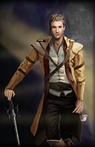
If I want to go for a really modern approach, I can blur out the background entirely, which gives the title text much more weight, and gives me the freedom move the author name about. I can even play with light. Of course, this would work better with a more recognisable image than a Chinese archway, but you get the general idea…

Then we have a longer author name. The colours I can use for it are now more limited if I want it to remain legible, and it needs balancing out with some text at the bottom. Still, it looks fine because the most important piece of text (the title in this case – Andy Pantaloons is not that famous) is short.
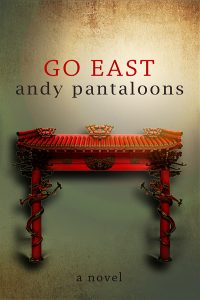
Things are getting tricky with this longer title! At this point, I would usually change the font and tweak the letter spacings to see if it would look better, but for the purposes of explaining the impact of title length, I’ve left it the same. It’s still just about okay, but if the author wants more images, the chances are they will fight for attention with the text.
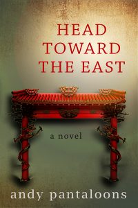
Time to pack my bag and go home! What a mess! There is just too much image for a title that size, and so I would either consider getting rid of the arch altogether, or throwing my laptop against the wall.

Of course, it is down to the designer to take whatever title you throw at them and make it look good, and we have a tonne of tricks for doing that, but if you like the minimalist look, and you want your cover to appear modern, AND there is an idea you want to convey in pictures, then consider a short title paired with a single, powerful image. This is one of my favourite examples from another designer (Eric White):

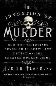
All of that said, here’s how a long title can look good. This cover is by Ervin Serrano, who did a brilliant job with the “The Invention of Murder: How the Victorians Revelled in Death and Detection and Created Modern Crime” but you can see how he had to sacrifice images (almost) altogether in order to make the overall design work and remain clear.
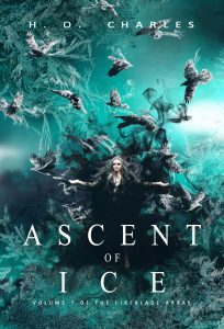
And of course, certain genres *demand* busy artwork, so I’ll neatly lever my most recent fantasy cover design in here, and thank you for reading!
H.O .Charles, a cover designer and author, was born in Northern England, but now resides in a beige house in Suffolk.
Charles has spent many years at various academic institutions, and really ought to get on with writing a PhD, but frequently becomes distracted by writing fantasy fiction instead.
Hobbies include being in the sea, being by the sea and eating things that come out of the sea.
Cover designs: www.hadleighdesign.blogspot.com
Author: www.hocharles.com
2 0 Read moreFeatured Books


WINTER WISHES: A REGENCY HOLIDAY ROMANCE ANTHOLOGY

Stories that will sweep you away . . .
More info →

ROAD TO YOU
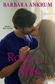
Investigative reporter Gemma Wade has been dispatched to her own personal purgatory—small town Marietta, Montana—to write a fluffy, romantic piece about the unprecedented spike in marriages there.
More info →