In the Flickering by Neetu
June 26, 2025 by Neetu Malik in category Poet's Day by Neetu Malik tagged as art, Caves, distance, echo of love, light, Neetu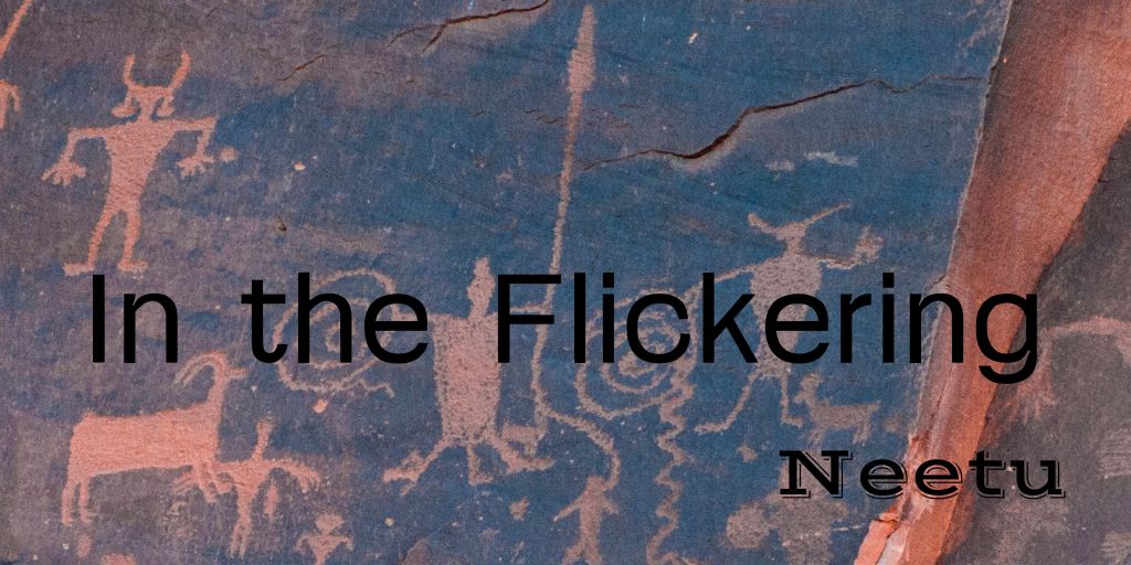
In the Flickering
Walk me through
your cave
show me the petroglyphs
the stories
you have laboriously pecked on the walls
with your hammer stone,
carved in the light of a lantern
where shadows cast gloom.
I want to see. I want to run
my warm hands along
cold rocks to decipher forms
and feel their rugged ridges.
This light is dim. I need a better view.
Hold my hand and place it where
the scenes begin
that you have etched, with squinted eyes
by a flickering lamp.
I trace them lightly,
my fingers grow numb—
in your cave’s icy hollows
there is no echo of love,
even your stories are silent.
Are you still here or am I
alone?
(c) Neetu Malik
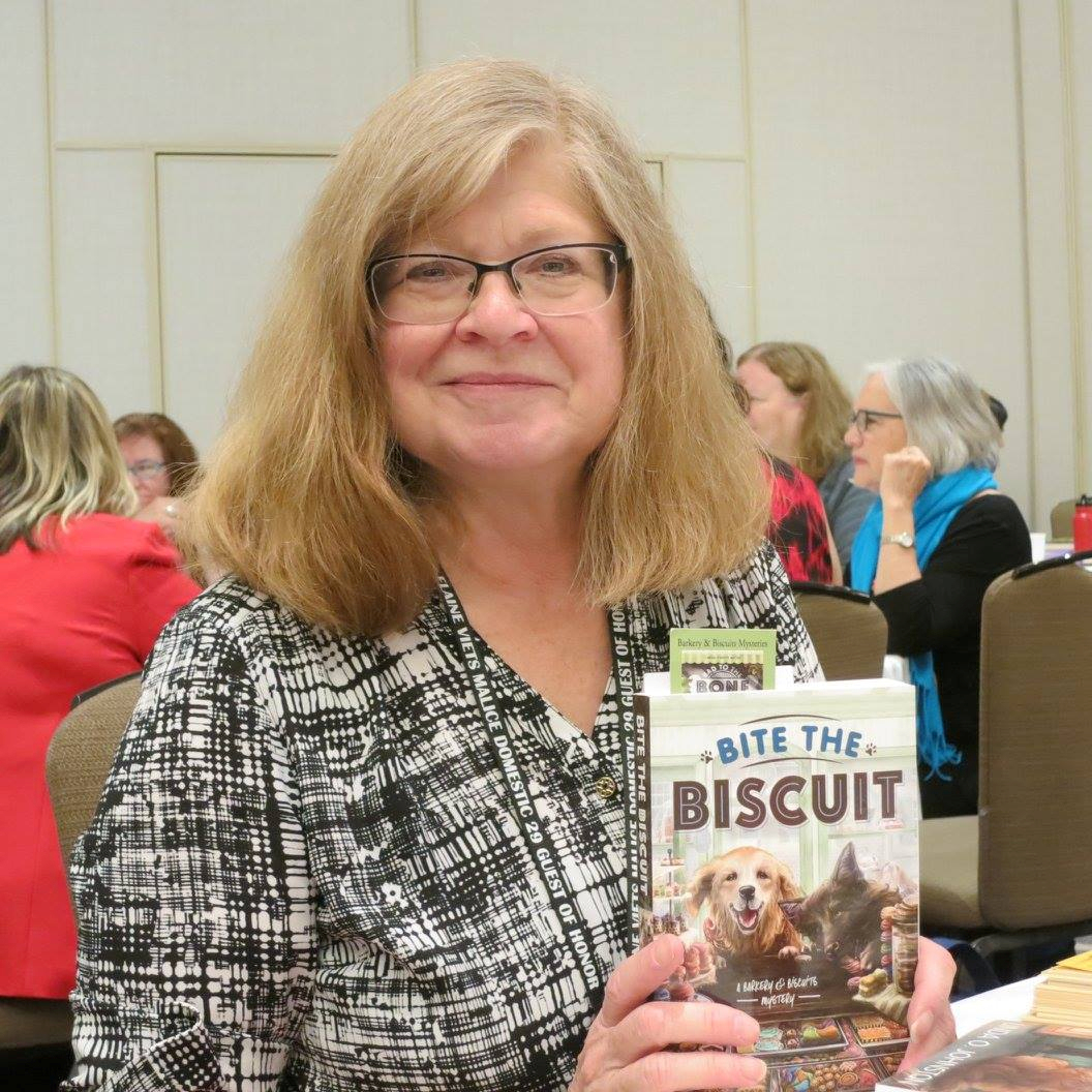
Some of Neetu’s Books


MIRROR, MIRROR: A WRITER’S REFLECTION BY VERONICA JORGE
May 22, 2025 by Veronica Jorge in category Write From the Heart by Veronica Jorge tagged as art, reflection, revelation, words, writing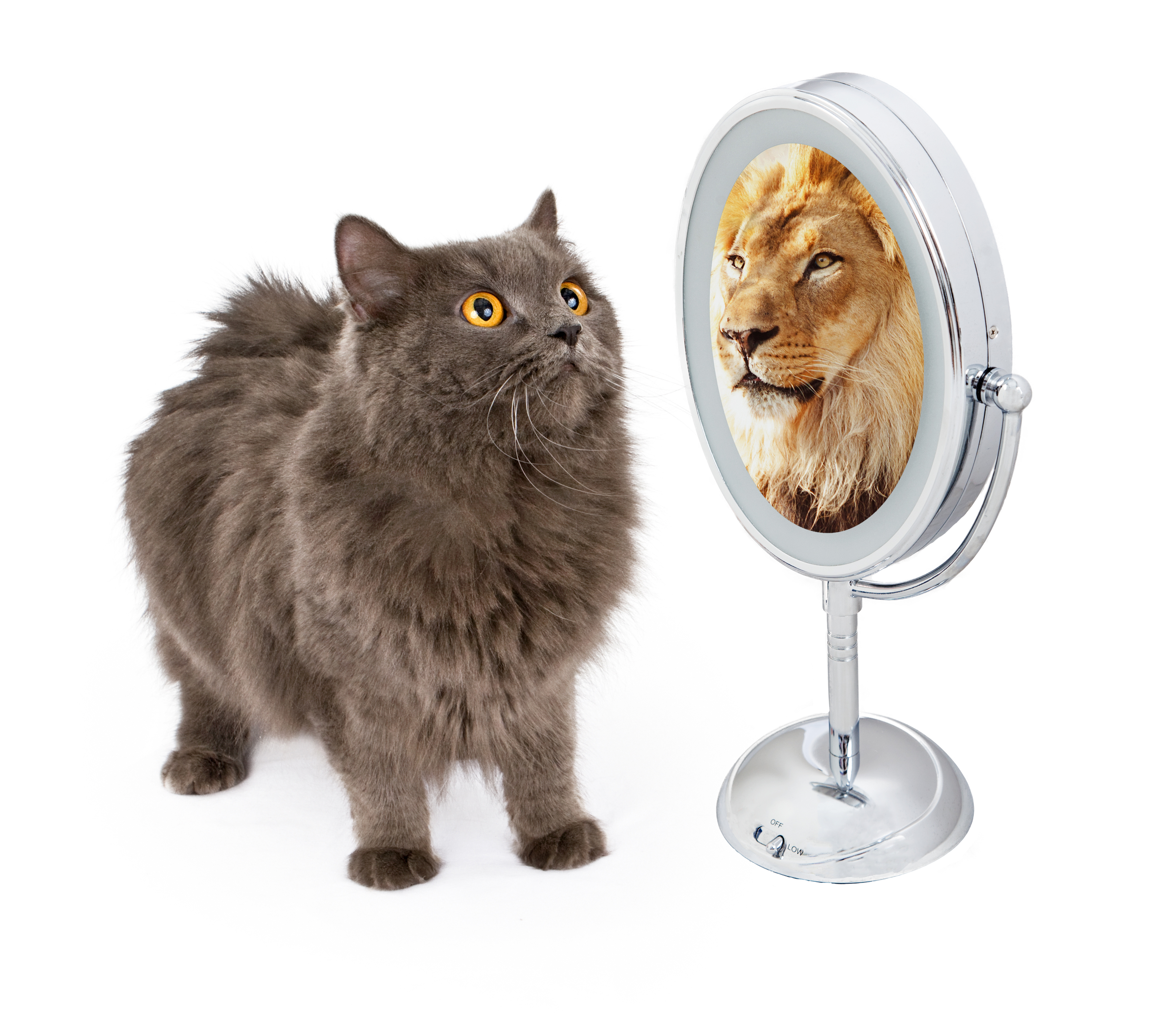
The painter stares at the canvas waiting for an image to appear. Patiently, he waits until a faint imprint of a landscape or a face emerges. He then grabs a brush and dabs it into the paint on his palette, making haste to reach the canvas with his brush to capture the image. The artist contrasts shade and light. He tightens or increases space. His brush moves rhythmically or scratches across the linen to make the colors and texture warm or cool. The work he renders leaves the viewer feeling airy or heavy.
That’s how I feel when I write. I stare at a blank page as though something secret lay hidden deep within the fibers and emptiness, that by patiently waiting will reveal itself to me. So I wait…until a word, a phrase, or a picture appears.
Could it be that the blank screen or journal page is a powerful mirror able to enlighten my own ideas and though ts? Is it I who write on the paper; or does the paper draw out what is inside of me?
My words pour out and my hand races across the page. My mind tries to keep up with both for they seem to move of their own volition depicting moments dark and light. Paragraphs heavy laden with emotion yield and give way to joy and humor, while spacing slows or hurries the reader along.
Finished, I sit back exhausted and, ignoring my headache, I read what I wrote. Awestruck, I ask, “Where did this come from?”
My trembling fingers turn the leaf to uncover a new blank page and my sweaty palm smooths the journal sheet flat. Pen in hand, I sit ready to capture another treasure. My eyes dilate seeking and waiting for new wonders to behold.
See you next time on June 22nd.
Veronica Jorge
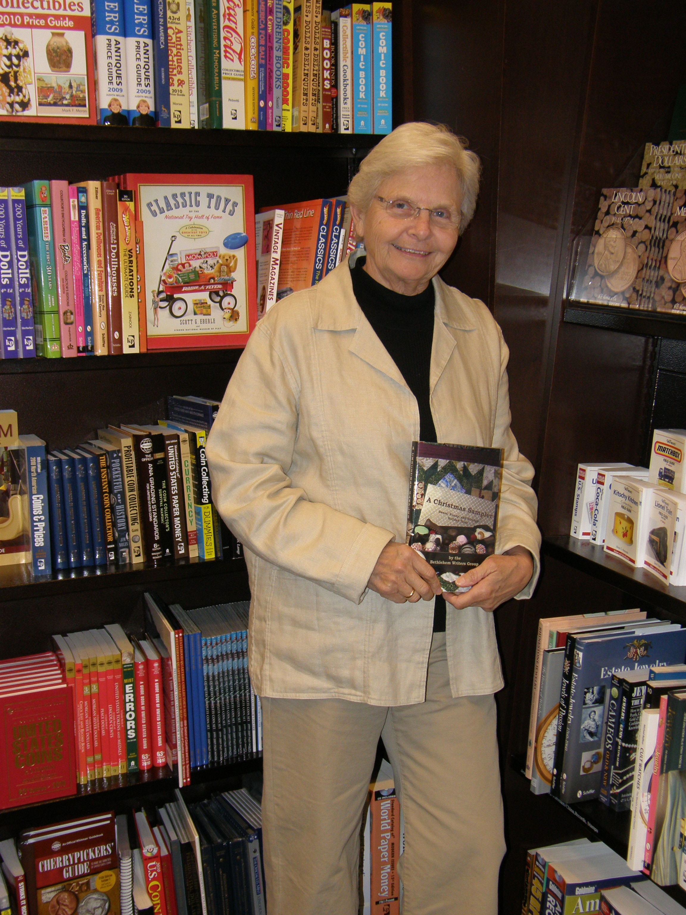
Books Review by Veronica


MIRROR, MIRROR: A WRITER’S REFLECTION BY VERONICA JORGE
April 22, 2018 by Veronica Jorge in category Write From the Heart by Veronica Jorge tagged as art, reflection, revelation, words, writing
The painter stares at the canvas waiting for an image to appear. Patiently, he waits until a faint imprint of a landscape or a face emerges. He then grabs a brush and dabs it into the paint on his palette, making haste to reach the canvas with his brush to capture the image. The artist contrasts shade and light. He tightens or increases space. His brush moves rhythmically or scratches across the linen to make the colors and texture warm or cool. The work he renders leaves the viewer feeling airy or heavy.
That’s how I feel when I write. I stare at a blank page as though something secret lay hidden deep within the fibers and emptiness, that by patiently waiting will reveal itself to me. So I wait…until a word, a phrase, or a picture appears.
Could it be that the blank screen or journal page is a powerful mirror able to enlighten my own ideas and thoughts? Is it I who write on the paper; or does the paper draw out what is inside of me?
My words pour out and my hand races across the page. My mind tries to keep up with both for they seem to move of their own volition depicting moments dark and light. Paragraphs heavy laden with emotion yield and give way to joy and humor, while spacing slows or hurries the reader along.
Finished, I sit back exhausted and, ignoring my headache, I read what I wrote. Awestruck, I ask, “Where did this come from?”
My trembling fingers turn the leaf to uncover a new blank page and my sweaty palm smooths the journal sheet flat. Pen in hand, I sit ready to capture another treasure. My eyes dilate seeking and waiting for new wonders to behold.
See you next time on May 22nd.
Veronica Jorge
4 0 Read moreSome summery covers to go with the weather
July 4, 2017 by H. O. Charles in category Art, Cover, Design by H. O. Charles, Writing tagged as art, book covers, designThat most sumptuous of seasons is now in full swing (in the northern hemisphere, at least) – there is a big, yellow thing in the sky, Wimbledon is on, and it’s the fourth of July!

No, really, I hope you all have a wonderful day of celebrations on your side of the pond. I shall raise a beer and a punnet of strawberries in each of your respective honours, even if I cannot guarantee queenie will.
On that summery note, I’ve picked out some summery-covered new releases. I cannot comment on the content, but what unites each of these is that they are recently published, that they have a very popular feel, and are therefore designed to be picked up by holiday-makers in their masses. Let’s go ahead and judge each of these books by their covers…
![Holiday in the Hamptons by [Morgan, Sarah]](https://i0.wp.com/images-eu.ssl-images-amazon.com/images/I/514Dy-FjbKL.jpg?resize=159%2C253&ssl=1)
Holiday in the Hamptons by Sarah Morgan
Summer cover checklist: palm trees, sunset, summer dress, sea view and even a lighthouse! A prerequisite of all summery covers is that they must include the colour blue, because blue skies make us happy and remind us of sunbathing, or something along those lines. Extra points go to this cover’s designer for obeying the rule of thirds.

Read, Write, Love at Seaside by Addison Cole
Aside from the colour blue, another thing you’ll find these covers have in common is the scripty style title writing. It’s a kind of code to the potential reader that says, “Hey, I’m popular, light-hearted fiction and JUST the sort of book you like to read on the beach!” What I like about this cover in particular is the way the artist has stuck to a limited palette – purple, blue and beige. It yields a much cleaner effect overall, and is visually quite satisfying. Points for including the cute dog in the beach bag, but I do hope the owner remembered to pack poo bags in there too.
![I Wish You Happy: A Novel by [King, Kerry Anne]](https://i0.wp.com/images-eu.ssl-images-amazon.com/images/I/51yeBAnBumL.jpg?resize=170%2C255&ssl=1)
I Wish You Happy by Kerry Anne King
Ah, some very seasonal dandelions! We’ve ventured away from the seaside, and are now running gaily through a summer field. Impressively, the character has managed to locate some fresh dandelions when all the others are expired, and hasn’t been savaged by patch of nettles and thistles, but hey, realism isn’t always quite as romantic as an artist would like. We’re back to the rule of thirds with this one, but I’m not sure I like the orange as part of the colour palette. Put it down to personal taste.
![The Summer House: A gorgeous feel good romance that will have you hooked by [Hale, Jenny]](https://i0.wp.com/images-eu.ssl-images-amazon.com/images/I/51hCaEaHD%2BL.jpg?resize=183%2C277&ssl=1)
The Summer House by Jenny Hale
You know, there’s photoshopping and there’s photoshopping. Perhaps this one is supposed to look cartoony and superimposed – I’m not sure, but it does do well in communicating that it’s a light summer read for you to breeze through on your hols (and it’s currently #215 in the UK Kindle chart, so clearly that fake photoshopping is not harming its sales). We have plenty on our summer cover checklist here: blue skies, voile curtains, flowers, beach, yachts and even a phallic lighthouse. How it does go against the grain is with the lack of scripty writing in the title, and instead the artist has chosen lowercase serif in a light colour, which is a reliable standard in pop fiction. Oh yeah, and it has ‘Summer’ in the title! Dead giveaway, but helpful for Amazon search bait.
![Summer at Buttercup Beach: A gorgeously uplifting and heartwarming romance by [Martin, Holly]](https://i0.wp.com/images-eu.ssl-images-amazon.com/images/I/51DoF%2BbJz1L.jpg?resize=182%2C280&ssl=1)
Summer at Buttercup Beach by Holly Martin
I challenge you to come up with a more summery title than this one! The colour palette has been limited to entirely summery colours, there’s beach, there’s sky, ferns and a deck chair. There’s nothing challenging in the image, which indicates there’s probably nothing challenging inside, either. It just screams to be added to your holiday reading collection with a happy, brainless grin upon its papery face.
So there’s my very brief summary of summery popular covers. If you want to tell your readers that popular, sunny fiction is the content of your novel, then these are the exactly the sorts of designs you should look at emulating. Now, I’m off to sit outside in the garden. Where was that beer…?
3 0 Read moreCover review: Half ‘n’ Half Covers
May 8, 2017 by H. O. Charles in category Art, Cover, Design by H. O. Charles tagged as art, book covers, covers, design, graphic designMy eye was caught this month by these rather attractive, bipartite covers in the Thriller section:
![He Said/She Said: the Sunday Times bestseller by [Kelly, Erin]](https://i0.wp.com/images-eu.ssl-images-amazon.com/images/I/513IiOz2Y8L.jpg?resize=198%2C305&ssl=1)
![My Husband the Stranger: An emotional page-turner with a shocking twist you'll never see coming by [Done, Rebecca]](https://i0.wp.com/images-eu.ssl-images-amazon.com/images/I/511IFByEhSL.jpg?resize=201%2C308&ssl=1)
![Two Sisters: A gripping psychological thriller with a shocking twist by [Wilkinson, Kerry]](https://i0.wp.com/images-eu.ssl-images-amazon.com/images/I/51xNGKEcpxL.jpg?resize=195%2C307&ssl=1)
What I really like about these three covers is the way they separate their titles into two halves using both contrasting colours and placement inside the background imagery.
Not only does this make a striking image, it also communicates the essence of the titles before the reader so much as thinks about the meaning of the words within them.
They tell you that there are two stories to be told, two points of view – a this and a that. Of course, the real world is not always so simple, and the stories within may not be either, but our human brain likes things to be reduced to simple statements, which is exactly what these covers are.
The great thing about this type of cover design is that it can be applied to so many novels, especially in something like the crime/thriller genre, where there is a question of innocence/guilt, or was it him/her? etc.
But the title has to work with the design. “He Said/She Said” is easy to balance and mirror, as is “My Husband the Stranger”. With “Two Sisters”, however, the designer has to forget the idea of perfect symmetry, and tie the words instead to background images that balance them out. Even though the words are different sizes, you are still left with the impression that they represent two individuals, who are likely quite contrasting in character, standing in that landscape.
So there you go – another design route to consider for your next novel!
I thought I’d also include a couple of “cover picks of the month” this time round, because they were so pretty (and tie in with what I was nattering on about last month re: minimalist titles and their covers)
![Kin: Helga Finnsdottir Book I by [Kristjansson, Snorri]](https://i0.wp.com/images-eu.ssl-images-amazon.com/images/I/519Utc%2B99CL.jpg?resize=194%2C304&ssl=1)
![Once Cold (A Riley Paige Mystery-Book 8) by [Pierce, Blake]](https://i0.wp.com/images-eu.ssl-images-amazon.com/images/I/41f-bTMCGbL.jpg?resize=196%2C295&ssl=1)
Aren’t they pretty? And also slightly spooky?!
 H.O .Charles, a cover designer and author, was born in Northern England, but now resides in a beige house in Suffolk.
Charles has spent many years at various academic institutions, and really ought to get on with writing a PhD, but frequently becomes distracted by writing fantasy fiction instead.
Hobbies include being in the sea, being by the sea and eating things that come out of the sea.
Cover designs: www.hadleighdesign.blogspot.com
Author: www.hocharles.com
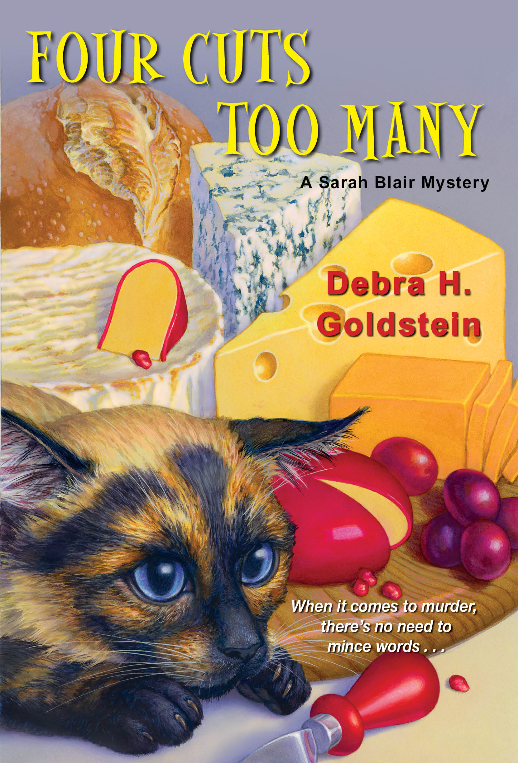
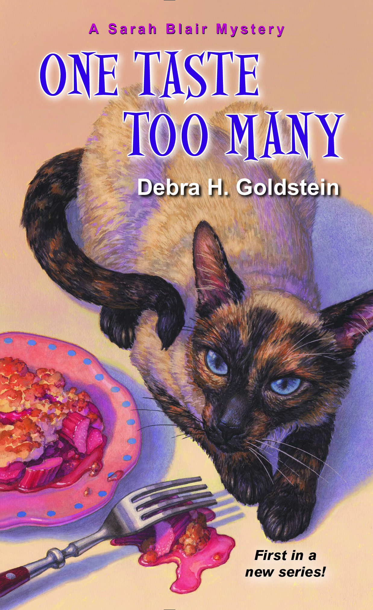
3 0 Read moreFeatured Books


INTIMATE RELATIONS

A woman in a window. A cop out of his element. A crime of unimaginable passion.
More info →THE DECEPTION
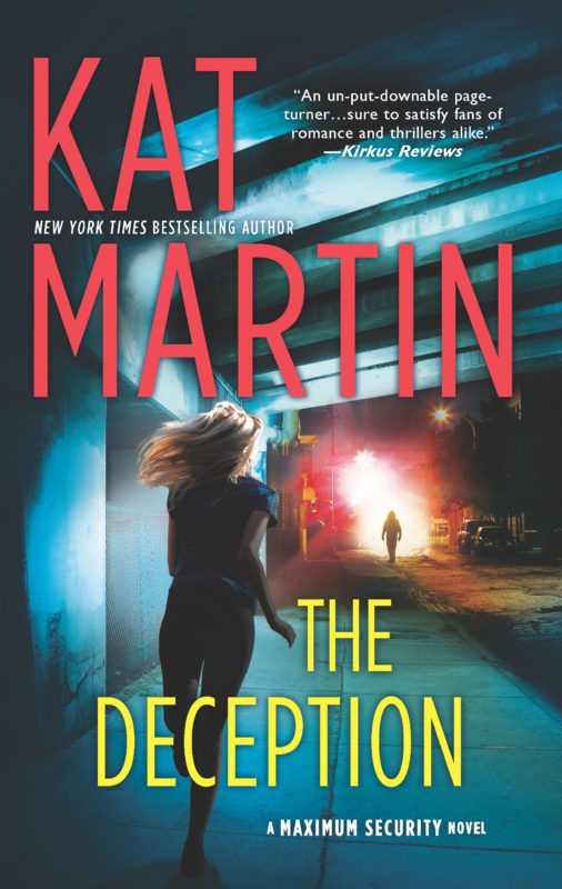
When missing turns to murdered, one woman's search for answers will take her to a place she never wanted to go…
More info →


P. R. I. S. M.
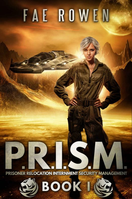
Can O'Neill and Jericho work together to unravel lies on both planets and still obtain the respect Jericho craves and the independence O'Neill needs?
More info →