All the Emotions with Designing My First Book Cover
March 12, 2024 by Denise M. Colby in category The Writing Journey by Denise Colby tagged as book covers, Denise M. Colby, writing lifeThis month I have had the pleasure of experiencing all the emotions of designing my first book cover. We all know how important book covers are. Book covers sell your book. They communicate what’s inside. And there are numerous blog and social media posts just on covers. So EVERYONE looks at book covers, because they are very important.

Initial thoughts for book cover designs
I think many of us newbie authors visualize what we think we want for our covers at the beginning of chapter 1. So I knew going in that I had an opinion. And ideas. Lots and lots of ideas. So how do you put all those ideas together into something appealing. A design that sells your book?
I have a graphic design background. Sort of. Things have kindof evolved since I was in college over thirty years ago, and even though I work in the field of marketing, my years of experience is more on layout now then specific design elements. I’m also a visual person. So I like to see something to see how it would work.
My publisher, Scrivenings Press, has a questionaire we fill out to add our ideas and thoughts behind the story for our book cover design. This is useful to communicate key messaging and visuals desired. I might’ve had a lot of ideas written down on my sheet. I certainly didn’t fill it out like a work project. Many emotions were tied into all my ideas. And it was hard for me to land on just one set.
Can anyone else out there relate?
Taking out the emotions when looking at book cover design
So I have to give a shoutout to my husband who asked me some very pointed questions like he would a marketing packaging project (he works in product marketing), since my book cover is my packaging.
This discussion was not emotional based, but true design and product packaging based. He asked me what is the main element of the story that you want people to know? And then asked to look at some books and guessed what the stories were inside.
When I told him what elements were most important, he agreed that those were in my cover design.
Our Emotions Can Get In The Way of Our Decision-Making
And this is when I realized I had a slew of emotions tied up into my cover design.
First, we spend years writing our first novel and agonize for weeks on the verbiage we use, editing continuously our words. My book cover was designed in less than a week. Something as important as a book cover shouldn’t be done overnight, right? But I have to remember my publisher makes mulitple covers a month and know what they are doing. They have standards and expertise. I need to trust that and get out of the way.
Second, we have so many ideas to convey the story on the front of our cover, but then realize that all those elements would make it way too busy and really don’t work the way we think it would’ve. Simpler really is better.
Third, I’m terrified how my cover will be received. But I’m also terrified on how my entire book will be recieved. So my emotions may not be just about the cover.
A Moment to Grow
Now that I’ve realized these new things (remember GROW is my word this year), I can learn from them. Processing emotions is an important step for me (and writing this blog post has helped me immensely).
I do not make decisions quickly. I kindof over think things a bit (Hello! Remember twelve years working on book 1). With a contract and deadlines (I love saying those words and wrote about that last month), everything is moving so fast and it’s all new territory.
There’s bound to be fear, uncertainty, and second-guessing. I need to allow myself room to feel those, but also know that this is all normal and not get caught up in them too much.
Clearly, I will have a much better handle on the process and my emotions for the next round (right?)
Now to agonize on how to do the cover reveal!
Denise’s first book, When Plans Go Awry, will launch June 4, 2024. Watch her facebook page and instagram page for her cover reveal
2 0 Read moreMom & Son Inc.
June 9, 2019 by Tari Jewett in category Charmed Writer by Tari Lynn Jewett tagged as 1st books, book covers, indie publishing, sons
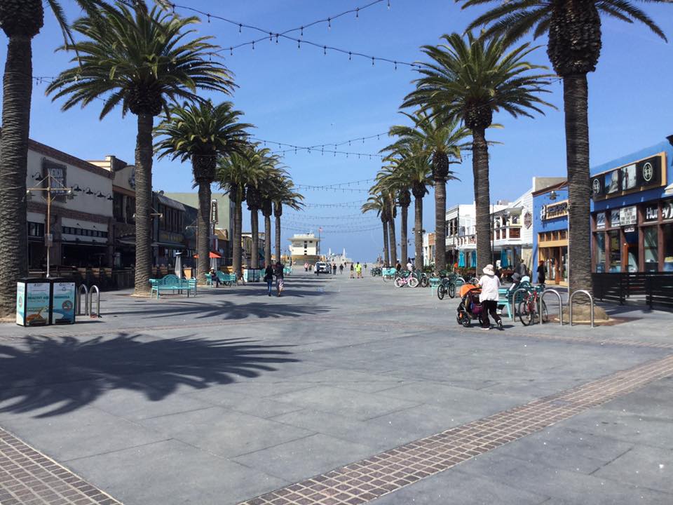
Hermosa Promenade
When our children are small, I think most of us fantasize about who they’ll be when they grow up. What they’ll look like, will they look like you? Or be entirely their own person? What kind of personality will they have? Will they be funny? Smart? Laid back or driven?
It’s the same with writing. When I start a story I wonder what it will look like when it’s done? What will the reader see? Will my intention come across? After all, our stories are our babies too!
Well, I’ve had the incredible, and unexpected experience of combining those two things. I’ve been working on books with my oldest son, Gerrod. I’m writing them, and he’s doing the artwork for the covers.

Hermosa Beach Clock
As you know, my first book, #PleaseSayYes, released last year in a boxed set. And I loved the cover. I thought it was adorable. But, when I got my rights back, and released it this February by itself, I wanted a new cover. I wanted something that said, not just romantic comedy, but Hermosa Beach romcom. I wanted something custom. But I couldn’t justify the expense.
And then Gerrod, my oldest son, approached me. He’s gone back to school, for digital graphic design, and asked if he could have a shot at my book covers. I was surprised, because I know my books aren’t the kind of thing he reads, and it’s not the kind of artwork he would normally choose to do, but I was also 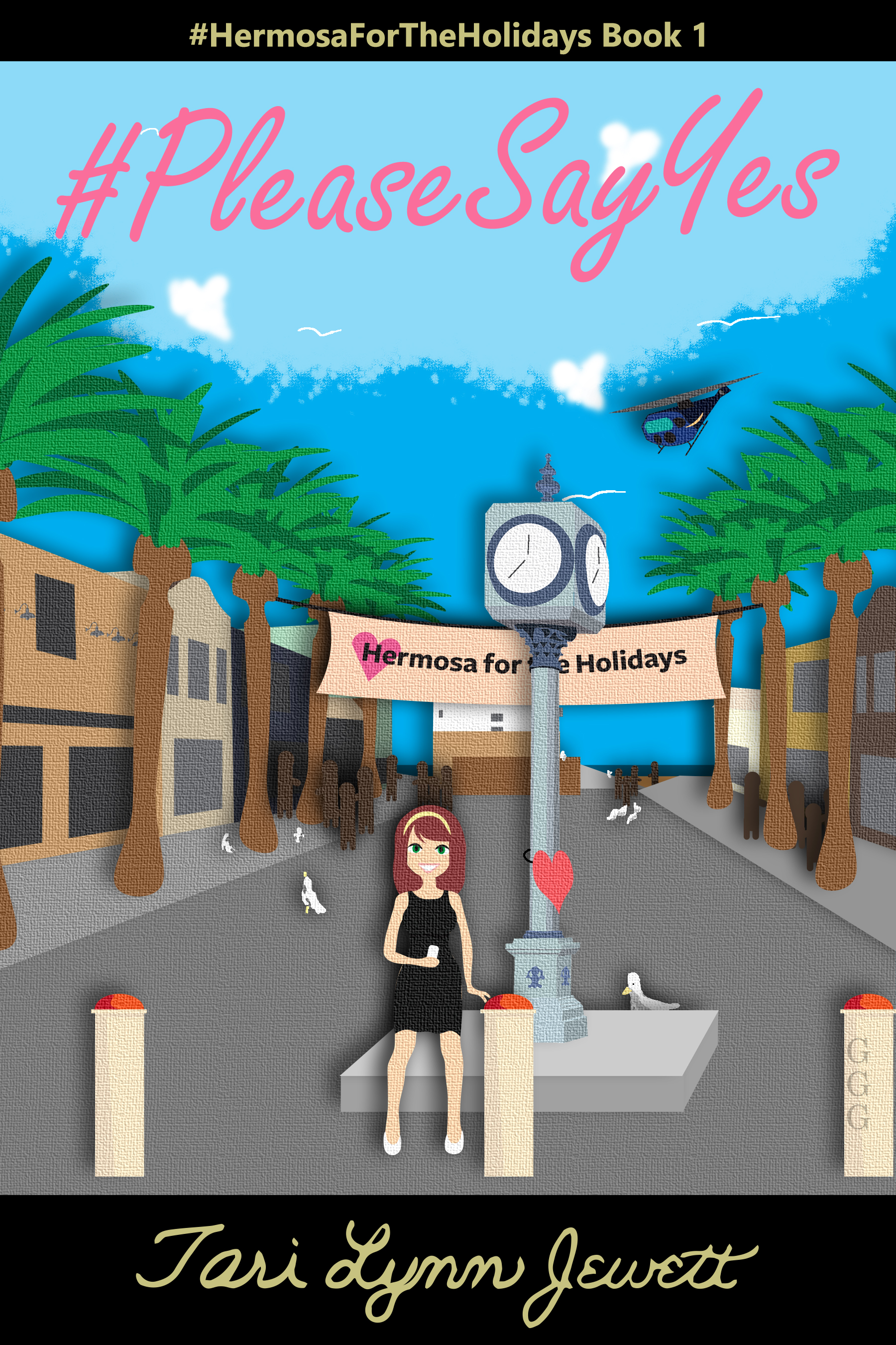 thrilled at the opportunity to work on a creative project with my son.
I also knew that being creative means not just doing what you want to do, what you know best, but stretching yourself into other areas. I wrote advertising and press releases for car products, television commercials for water purification companies, and so many other writing projects that had nothing to do with me, but that required creativity and artistic skill.
We are however both new to this, and learning together could be a good thing or a bad thing. I didn’t want my writing project to cause friction between us.
So, of course, we dove into this project head first.
I gave Gerrod some photos of Hermosa Beach, and sent samples of other romcom covers that I liked, in order to give him an idea of where I wanted to go. He used what I’d given him to digitally hand draw sample scenes for me. It was rough at first, and more than a couple of times when the stress of the project, a death in the family, and other things got in the way I wanted to walk away. I’m sure he considered it as well, although regardless of what happened, he stayed on track, worked with me, and tried to give me what I wanted.
We argued about a few details here and there, but generally he agreed it was my book, and he did whatever it took. EXCEPT for when it came to my name. He felt that my handwriting was unique in itself and 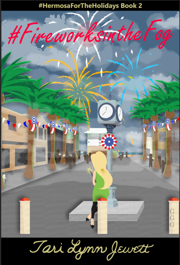 should go on the book. I, disagreed, and on this issue he dug in. Eventually, I relented, and the more I saw it on the cover, the more I liked it. (You can tell me what you think.)
But ultimately, I had the last say, I wanted him to sign his work. I was thrilled with the final product. On the post in the bottom right hand corner, you’ll see GGG. Those are Gerrod’s initials. They’re also on the back, bottom right hand corner by the helicopter!
Once book one was done, book 2, which will be released in just a few weeks, and book 3 coming in October, were a breeze to complete! I’m not supposed to share yet, but I just can’t help myself! I hope you like the cover for #FireworksintheFog as much as I do! But, you’ll have to wait to see book 3, Haunted Hermosa.
Bottom line, proud mama moment, and so thrilled to be sharing this experience with my son. We’re learning about the process together, and learning to work together as two artists, not mother and son.
So, they grow up, and become their own people, and sometimes, if you’re very lucky, who they are as an individual, and who you are as an individual are able to find a common ground, a special place that the two of you can share.
7 0 Read more
Rebranding …The Covers
February 5, 2019 by Tracy Reed in category Pink Pad by Tracy Reed tagged as book covers, Marketing For Romance Writers, rebranding, Tracy Reed
REBRANDING…THE COVERS
Last month I shared about my plans to rebrand myself as an author. This month I started putting the plan into action. Excuse me while I pause for a little childish whining…this is hard.
Now I’m back to my adult self. No one who has gone through the rebranding process said it would be easy. It’s more like masochism. How is it possible to derive pleasure from such a challenging process? But it’s exciting seeing the changes come to life.
I have another business and had the opportunity to work with a consultant and was shocked at what I learned about my business. I’ve been an entrepreneur for quite a while. I thought I knew my business, but in the back of my mind I always felt I could be doing more…doing better. So when the opportunity arose to work with a consultant, I jumped at it.
I thought I had my stuff together, but after the first meeting, I realized I didn’t know crap about my business. When she asked me “Who my customer was?” I gave my answer. Only to discover, it was too broad. I thought my website was amazing, after all, the site host, family and friends, all said it was great. They were sincere in their compliment. However, the reality was, my social media was a mess [Thank God Elena Dillion helped me with my Pinterest page before my first meeting, giving me one brownie point with the consultant]. There was a mix of styles. The colors and graphics were all over the place. My business profile had no cohesion.
When I completed the process with the consultant, my business had a definite brand. So when I listened to the RAM speakers talk about rebranding, I understood because I’d just gone through it with my other business. However, this was a little more difficult because the product that needed a new look was something I created. Something I needed to take a hard look at.
As writers we are very creative, but sometimes we’re not as objective to the marketing process as we need to be. I’m not saying you have to design your own covers and graphics. You do however, need to know what the trends are in your category and most importantly, you need to know who your reader is. And make the necessary changes no matter how painful it is.
I write Contemporary Romance with African American Romance as my secondary category. The books in these categories are similar. I looked at the also boughts for the titles I wanted to change and came up with designs I liked. The commonality for both categories was shirtless men or couples. My two most downloaded books have shirtless men wherever possible or a hot couple. Of course there’s an exception to every rule. For me that rule is having a woman on the cover. My third most downloaded book, has a woman on the cover.
My cover design plan included shirtless men, couples, bold fonts and eye catching blurbs.
I’m using stock images right now. I would love to use exclusive images on some of the books, but I first want to see what the reaction is going to be. Don’t get me wrong, there’s nothing wrong with stock images. However, if you can afford to use an exclusive image, do it. Most exclusive images give you a little more latitude in use. If an exclusive image isn’t an option and you can’t find anything you like with one of the stock image sites, there are several free sites with nice images. Some of the free image sites allow for a little more flexibility in use. I’ve used www.unsplash.com and www.pexels.com .
I have been in the creative lab and wanted to share some of the new covers. [These are all stock images from Deposit photos.] I have a little tweaking to do before making these live.
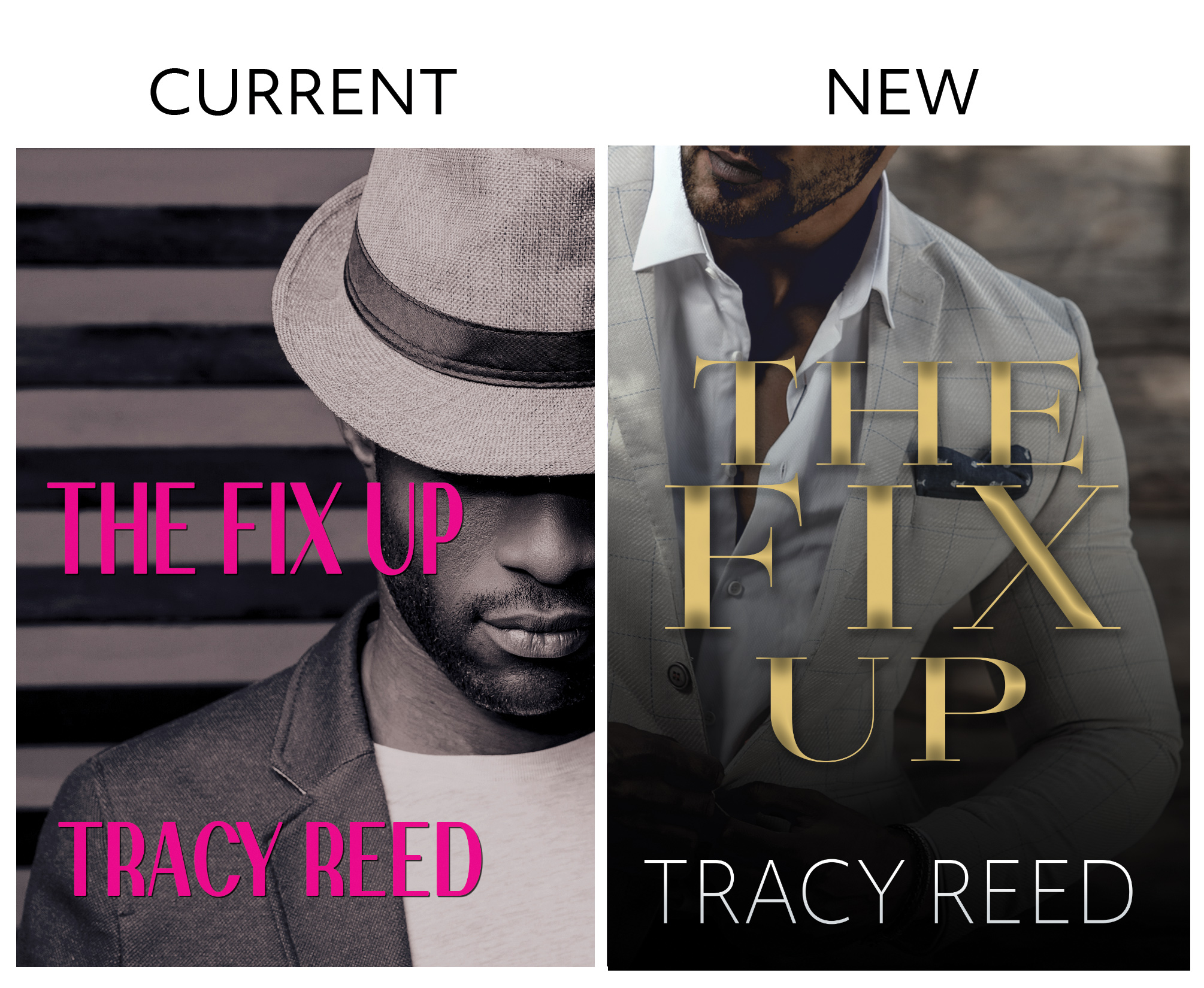
THE FIX UP…
I like the original cover, unfortunately, after a couple of years, the bloom is off the rose. The new cover was originally A Southern Gentleman Vol 2. The new image felt more in tune with the character.
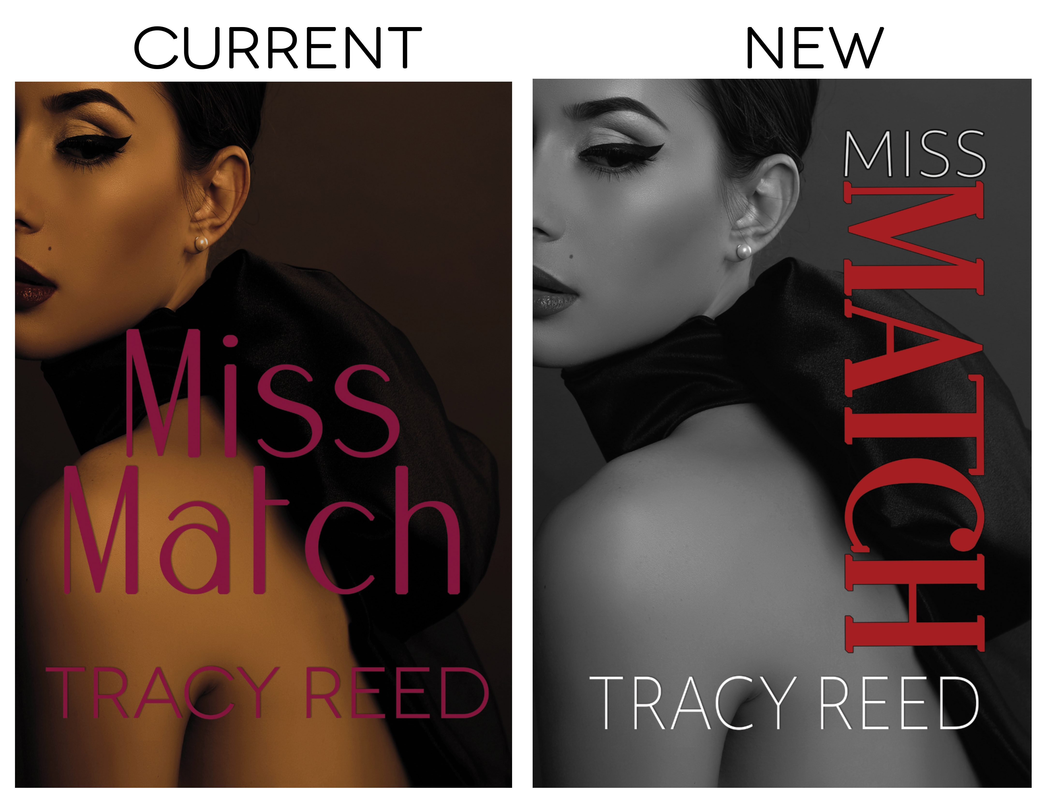
MISS MATCH…
I like the image, but the font is horrible. I’m pretty sure the poor font choice is why this book isn’t moving as well as it should. I opted not to change the image because I might want a new look when I release book two and what a cohesive look.
FIRST ENCOUNTERS OF LOVE…
This was my first boxset. It does fair. However, the image is similar to another one which does well. You’d think this would benefit. However, I think the other image confuses people or makes them think they already bought the box set. I’m going to try something I’ve never done before, a couple. I know the shirtless man does well, I’m hoping the couple does just as well.

Before I finalize a cover, I ask my reader group for feedback and then run test ads on BookBub and Facebook. The one with the best results is the winner.
My plan is to start releasing the new covers this month.
Next month, I’ll share all of the updated covers and talk about my production schedule.
Happy writing.
3 0 Read moreHappy Writing Anniversary and Happy Holidays by @readtracyread
December 5, 2017 by Tracy Reed in category Pink Pad by Tracy Reed tagged as book covers, publishing, writing
Happy Writing Anniversary and Happy Holidays
I’m going to keep this short and sweet because, I know you are probably swamped with holiday preparations and those end of year releases. Congratulations to everyone and their releases this year and the many that will be born next year. The gift of writing is an amazing blessing and one we should never take for granted, but honored to share.
Last year, I took on a huge project, 12 Titles in 12 Months. The reality was, it was thirteen titles. I often forget about one of the books, because it’s not available to the public, because I use it for my lingerie business.
To this day, I’m not exactly sure what I was thinking taking on such a huge project. Trust me it wasn’t for vanity. However, there was a book I really wanted to include in the challenge but it just didn’t happen…DESPERATE DESIRE. Cori, I refer to my books by the heroine’s name. It’s like men with their cars. I think it makes them seem more real.
So, Cori’s story is the third installment in the Generational Curse series. It was my intention to share her story this month, on the anniversary of her sister Kyla’s story, Generational Curse, but life happened. I heard someone say, if you want to make God laugh, tell Him your plan.
Once I got over the disappointment of my plan not coming to fruition, I pushed the release date back a month. The push back was very necessary, because I needed to make a few changes. I write books that have a faith message and/or Christians struggling with their walk. Cori and her husband are Christians, however he’s having an affair and she’s contemplating doing like wise. As if that wasn’t tragic enough, I gave her a few vices, erotica, weed and expensive whiskey. So when I looked at the original cover, it didn’t work.
I got the original cover image for this book a few years ago. No, that’s not a typo. I originally bought the image when I was shopping for images for book one…Generational Curse. I wanted a consistent look with the series and the original was nice. I ran it through a series of changes in Photoshop and it was done. Then something happened, I was working on the website for my other business and found myself with an image I could no longer use. I didn’t want to just cast the image to the side, but thought it would make a nice cover. I did a little tweaking and when I finished, I knew that was the image for Desperate Desire.
Although this book is part of a series, it has the personality of a stand alone. The original cover was similar to it’s predecessor, however, the new one really spoke of the heroine’s personality and her journey to discovering love. Next month I’ll do the cover reveal and share more of Cori’s story.
So as I prepare to celebrate the holidays, I’m also celebrating the third anniversary of my first book, GENERATIONAL CURSE and preparing to release my nineteenth title. Wow…now ain’t that something.
Happy Holidays
Tracy Reed

A California native, novelist Tracy Reed pushes the boundaries of her Christian foundation with her sometimes racy and often fiery tales.
After years of living in the Big Apple, this self proclaimed New Yorker draws from the city’s imagination, intrigue, and inspiration to cultivate characters and plot lines who breathe life to the words on every page.
Tracy’s passion for beautiful fashion and beautiful men direct her vivid creative power towards not only novels, but short stories, poetry, and podcasts. With something for every attention span.
Tracy Reed’s ability to capture an audience is unmatched. Her body of work has been described as a host of stimulating adventures and invigorating expression.
https://www.facebook.com/readtracyreed
https://www.bookbub.com/authors/tracy-reed
https://www.instagram.com/readtracyreed/


Some summery covers to go with the weather
July 4, 2017 by H. O. Charles in category Art, Cover, Design by H. O. Charles, Writing tagged as art, book covers, designThat most sumptuous of seasons is now in full swing (in the northern hemisphere, at least) – there is a big, yellow thing in the sky, Wimbledon is on, and it’s the fourth of July!

No, really, I hope you all have a wonderful day of celebrations on your side of the pond. I shall raise a beer and a punnet of strawberries in each of your respective honours, even if I cannot guarantee queenie will.
On that summery note, I’ve picked out some summery-covered new releases. I cannot comment on the content, but what unites each of these is that they are recently published, that they have a very popular feel, and are therefore designed to be picked up by holiday-makers in their masses. Let’s go ahead and judge each of these books by their covers…
![Holiday in the Hamptons by [Morgan, Sarah]](https://i0.wp.com/images-eu.ssl-images-amazon.com/images/I/514Dy-FjbKL.jpg?resize=159%2C253&ssl=1)
Holiday in the Hamptons by Sarah Morgan
Summer cover checklist: palm trees, sunset, summer dress, sea view and even a lighthouse! A prerequisite of all summery covers is that they must include the colour blue, because blue skies make us happy and remind us of sunbathing, or something along those lines. Extra points go to this cover’s designer for obeying the rule of thirds.

Read, Write, Love at Seaside by Addison Cole
Aside from the colour blue, another thing you’ll find these covers have in common is the scripty style title writing. It’s a kind of code to the potential reader that says, “Hey, I’m popular, light-hearted fiction and JUST the sort of book you like to read on the beach!” What I like about this cover in particular is the way the artist has stuck to a limited palette – purple, blue and beige. It yields a much cleaner effect overall, and is visually quite satisfying. Points for including the cute dog in the beach bag, but I do hope the owner remembered to pack poo bags in there too.
![I Wish You Happy: A Novel by [King, Kerry Anne]](https://i0.wp.com/images-eu.ssl-images-amazon.com/images/I/51yeBAnBumL.jpg?resize=170%2C255&ssl=1)
I Wish You Happy by Kerry Anne King
Ah, some very seasonal dandelions! We’ve ventured away from the seaside, and are now running gaily through a summer field. Impressively, the character has managed to locate some fresh dandelions when all the others are expired, and hasn’t been savaged by patch of nettles and thistles, but hey, realism isn’t always quite as romantic as an artist would like. We’re back to the rule of thirds with this one, but I’m not sure I like the orange as part of the colour palette. Put it down to personal taste.
![The Summer House: A gorgeous feel good romance that will have you hooked by [Hale, Jenny]](https://i0.wp.com/images-eu.ssl-images-amazon.com/images/I/51hCaEaHD%2BL.jpg?resize=183%2C277&ssl=1)
The Summer House by Jenny Hale
You know, there’s photoshopping and there’s photoshopping. Perhaps this one is supposed to look cartoony and superimposed – I’m not sure, but it does do well in communicating that it’s a light summer read for you to breeze through on your hols (and it’s currently #215 in the UK Kindle chart, so clearly that fake photoshopping is not harming its sales). We have plenty on our summer cover checklist here: blue skies, voile curtains, flowers, beach, yachts and even a phallic lighthouse. How it does go against the grain is with the lack of scripty writing in the title, and instead the artist has chosen lowercase serif in a light colour, which is a reliable standard in pop fiction. Oh yeah, and it has ‘Summer’ in the title! Dead giveaway, but helpful for Amazon search bait.
![Summer at Buttercup Beach: A gorgeously uplifting and heartwarming romance by [Martin, Holly]](https://i0.wp.com/images-eu.ssl-images-amazon.com/images/I/51DoF%2BbJz1L.jpg?resize=182%2C280&ssl=1)
Summer at Buttercup Beach by Holly Martin
I challenge you to come up with a more summery title than this one! The colour palette has been limited to entirely summery colours, there’s beach, there’s sky, ferns and a deck chair. There’s nothing challenging in the image, which indicates there’s probably nothing challenging inside, either. It just screams to be added to your holiday reading collection with a happy, brainless grin upon its papery face.
So there’s my very brief summary of summery popular covers. If you want to tell your readers that popular, sunny fiction is the content of your novel, then these are the exactly the sorts of designs you should look at emulating. Now, I’m off to sit outside in the garden. Where was that beer…?
3 0 Read moreFeatured Books


HELLO SPAIN, GOODBYE HEART

Dayna hopes for a second chance at love . . . but . . .he wears a wedding band.
More info →
COLTON FIRST RESPONDER (The Coltons of Mustang Valley)
When disaster strikes
A Colton comes to the rescue


FOREIGN RELATIONS

A foreign woman is dead, two countries want her forgotten. Detective Finn O'Brien wants justice.
More info →