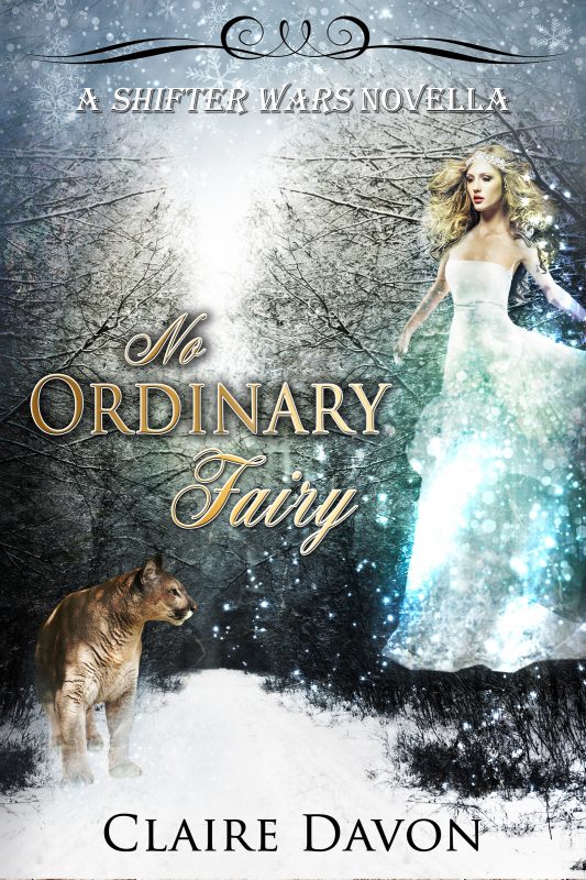
Rebranding …The Covers
February 5, 2019 by Tracy Reed in category Pink Pad by Tracy Reed tagged as book covers, Marketing For Romance Writers, rebranding, Tracy Reed
REBRANDING…THE COVERS
Last month I shared about my plans to rebrand myself as an author. This month I started putting the plan into action. Excuse me while I pause for a little childish whining…this is hard.
Now I’m back to my adult self. No one who has gone through the rebranding process said it would be easy. It’s more like masochism. How is it possible to derive pleasure from such a challenging process? But it’s exciting seeing the changes come to life.
I have another business and had the opportunity to work with a consultant and was shocked at what I learned about my business. I’ve been an entrepreneur for quite a while. I thought I knew my business, but in the back of my mind I always felt I could be doing more…doing better. So when the opportunity arose to work with a consultant, I jumped at it.
I thought I had my stuff together, but after the first meeting, I realized I didn’t know crap about my business. When she asked me “Who my customer was?” I gave my answer. Only to discover, it was too broad. I thought my website was amazing, after all, the site host, family and friends, all said it was great. They were sincere in their compliment. However, the reality was, my social media was a mess [Thank God Elena Dillion helped me with my Pinterest page before my first meeting, giving me one brownie point with the consultant]. There was a mix of styles. The colors and graphics were all over the place. My business profile had no cohesion.
When I completed the process with the consultant, my business had a definite brand. So when I listened to the RAM speakers talk about rebranding, I understood because I’d just gone through it with my other business. However, this was a little more difficult because the product that needed a new look was something I created. Something I needed to take a hard look at.
As writers we are very creative, but sometimes we’re not as objective to the marketing process as we need to be. I’m not saying you have to design your own covers and graphics. You do however, need to know what the trends are in your category and most importantly, you need to know who your reader is. And make the necessary changes no matter how painful it is.
I write Contemporary Romance with African American Romance as my secondary category. The books in these categories are similar. I looked at the also boughts for the titles I wanted to change and came up with designs I liked. The commonality for both categories was shirtless men or couples. My two most downloaded books have shirtless men wherever possible or a hot couple. Of course there’s an exception to every rule. For me that rule is having a woman on the cover. My third most downloaded book, has a woman on the cover.
My cover design plan included shirtless men, couples, bold fonts and eye catching blurbs.
I’m using stock images right now. I would love to use exclusive images on some of the books, but I first want to see what the reaction is going to be. Don’t get me wrong, there’s nothing wrong with stock images. However, if you can afford to use an exclusive image, do it. Most exclusive images give you a little more latitude in use. If an exclusive image isn’t an option and you can’t find anything you like with one of the stock image sites, there are several free sites with nice images. Some of the free image sites allow for a little more flexibility in use. I’ve used www.unsplash.com and www.pexels.com .
I have been in the creative lab and wanted to share some of the new covers. [These are all stock images from Deposit photos.] I have a little tweaking to do before making these live.
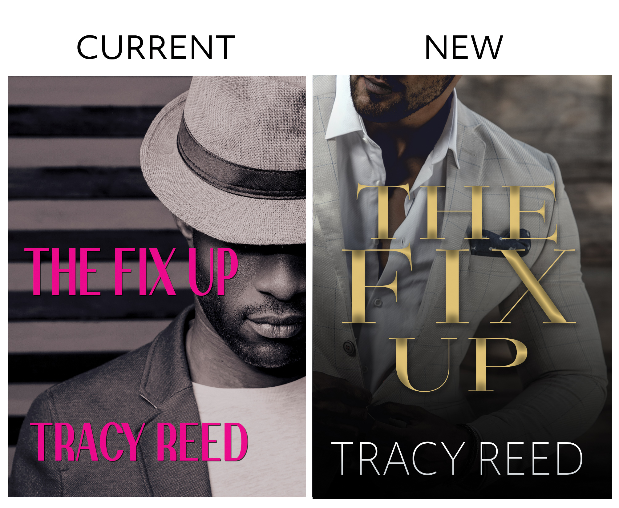
THE FIX UP…
I like the original cover, unfortunately, after a couple of years, the bloom is off the rose. The new cover was originally A Southern Gentleman Vol 2. The new image felt more in tune with the character.
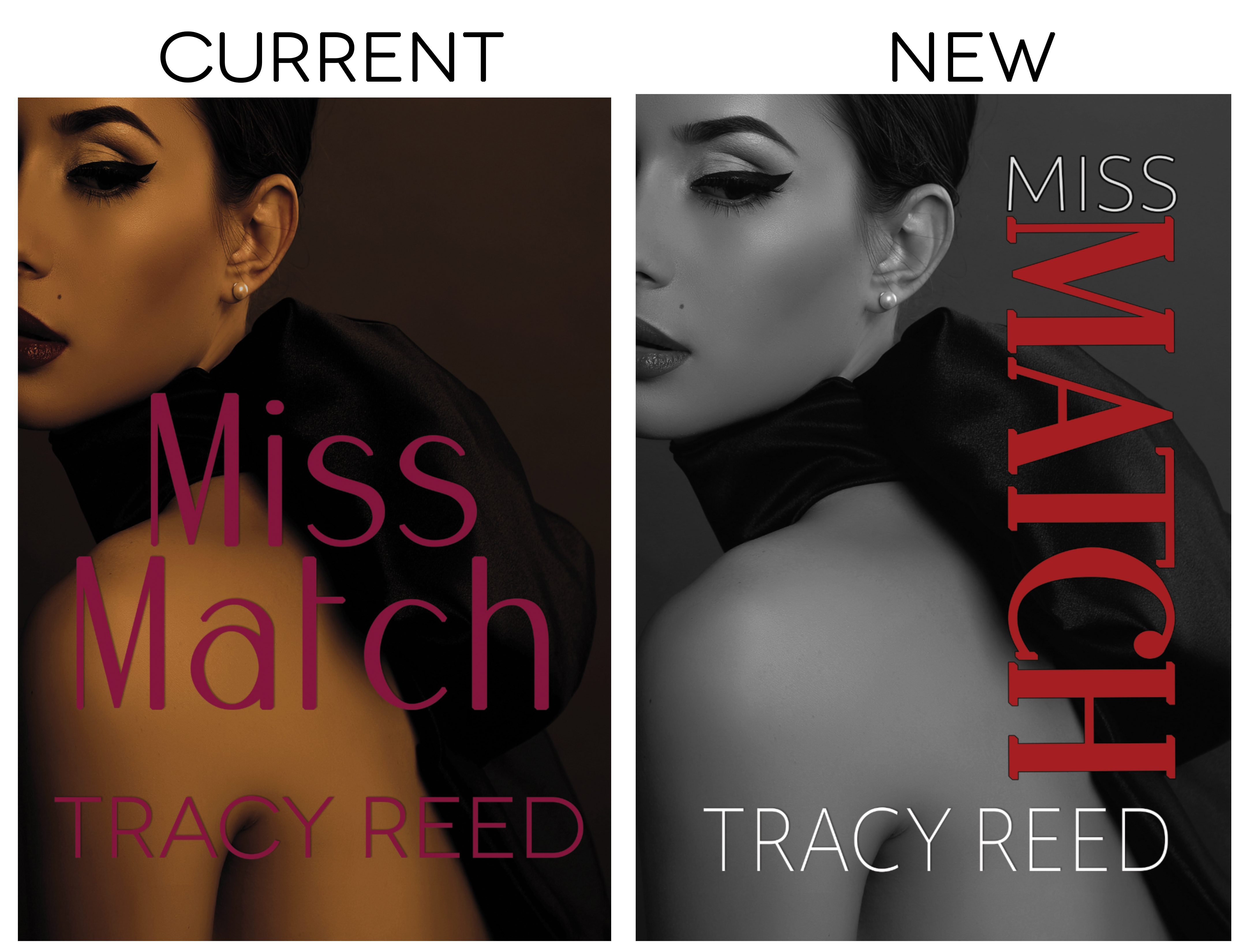
MISS MATCH…
I like the image, but the font is horrible. I’m pretty sure the poor font choice is why this book isn’t moving as well as it should. I opted not to change the image because I might want a new look when I release book two and what a cohesive look.
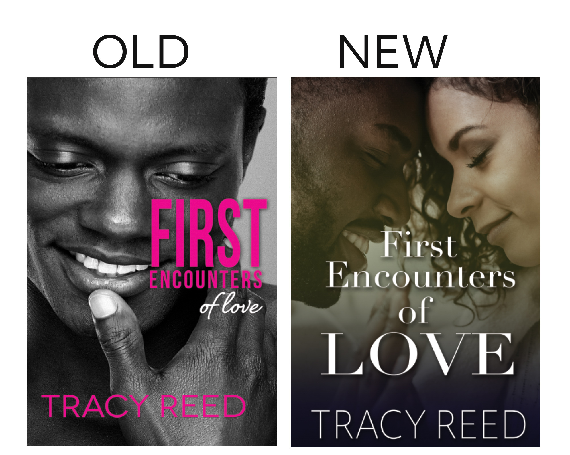
FIRST ENCOUNTERS OF LOVE…
This was my first boxset. It does fair. However, the image is similar to another one which does well. You’d think this would benefit. However, I think the other image confuses people or makes them think they already bought the box set. I’m going to try something I’ve never done before, a couple. I know the shirtless man does well, I’m hoping the couple does just as well.
Before I finalize a cover, I ask my reader group for feedback and then run test ads on BookBub and Facebook. The one with the best results is the winner.
My plan is to start releasing the new covers this month.
Next month, I’ll share all of the updated covers and talk about my production schedule.
Happy writing.
3 0 Read moreFeatured Books
To L. A. With Love Volume 1

When wildfires damaged two beloved Los Angeles public libraries in January 2025, the romance community answered with heart.
More info →


ONCE UPON ANOTHER WORLD: A Twisted Fairy Tale Box Set
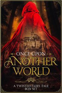
Not all fairy tales are as they appear.
More info →