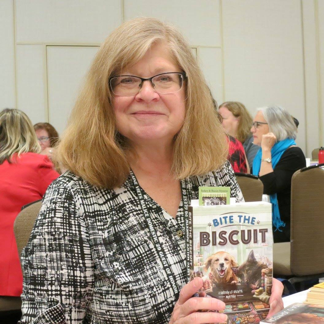
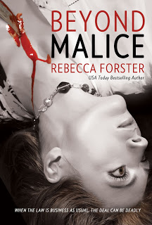
Cover Me
August 15, 2018 by Rebecca Forster in category The Write Life by Rebecca Forster tagged as books, communication, cover, cover design, covers, Craft, design, writing I find it difficult to write – or speak – in short form. To communicate, I must take not just the road less traveled but also all roads in between. My children say a conversation with me is like trying to keep your head above water in the ocean while being knocked about by swells and the occasional rogue wave. I’m not sure if my husband share’s this opinion. Then again, I’m not sure my husband’s hearing is up to snuff.
When my boys were small they begged me to write a children’s book. I ended with fifty thousand words and killed off most of the characters, so my one effort really wasn’t suitable for children (it was, however, the basis for a later novel).
I had a similar problem with lullabies. As a young mother I realized I didn’t know any. Still, I was determined to be maternal and sing my boys to sleep. In those days Cops was all the rage and the theme song was catchy, so I softly sang “bad boys, bad boys, whatcha going to do when Sheriff Brown comes for you?” Years later, my sons told me that they would stare wide-eyed into the night waiting for the police to come get them because they were pretty sure they were bad boys. Luckily, they have stopped asking me to write a children’s book and these days no one wants to hear me sing.
All this brings me to the point. It can be unbearably difficult for a cover designer to work with someone like me. Up front I am apologizing to Hadleigh O.Charles (cover designer) for my inability to be decisive, my tendency to forward six thousand royalty free photos for her consideration, and my failure to understand that the blue stripes at the top of an email mean there is something for me to download. Since I have learned nothing from my children’s assessment of my communication style, my emails to Hadleigh are like the verbal pinging of a steel ball inside a bell.
E-mail #1: Hadleigh, are you there? Hadleigh? I need a cover.
Hadleigh’s response: I’m here
E-mail #2: Well, it’s for the (fill in the blank) series and the story is about (fill in the character) and (fill in three thousand plot points) and I’m attaching a few images – but then again you probably have some ideas – so shoot me what you think and – oh, wait – how’s the dog? Hope it’s not too hot where you are. But then again the story really is about people buried in the desert – then again maybe a half naked woman on the front would be better. . . in silhouette, of course. . .”
Hadleigh’s response: Silence
E-mail #3 (usually a minute later so to be fair she hasn’t had time to respond): Hadleigh, really, you do what you want, but I don’t think we should have blood. Do you think we should have blood? Have you seen other thriller authors use a lot of blood? I’m going to visit my mom so don’t worry if you don’t hear from me for a day. . . Still, here are a couple of links – okay ten links – maybe more – so you can take a look at the top ten (maybe more) bestsellers in my genre – when you have time. But I would like to be a little different. Like them but not the same. Better. You know? Like bestseller better. No hurry. I’m seriously going to visit my mom overnight.
Hadleigh’s response: Silence (perhaps she knows that I am writing email #4 within five minutes of email #3)
E-mail #4: Five pages peppered with ideas, apologies for bothering her, explanations, useless terms that I think describe typeface, color and composition.
I hit DELETE.
Hadleigh’s response (a day or so later): Three beautiful covers that somehow incorporate tiny specks of rational thought mined from my manic ramblings. She also sends an update on her dog.
Unlike my children, Hadleigh does not lay wide-eyed and paralyzed by my avalanche of input, yet like my children she manages to figure out what’s important. Hadleigh, love you and every other cover designer out there. So happy you have all us authors covered.
 REBECCA FORSTER started writing on a crazy dare. Now she is a USA Today and Amazon best selling author with over 30 books to her name. These include the acclaimed Witness Series, Josie Bates Thrillers and her latest, The Finn O’Brien Thrillers. She is married to a superior court judge and is the mother of two grown children. When not writing, Rebecca is traveling the world looking for inspiration, sewing, playing tennis and reading.
Sign up for Rebecca’s spam-free mailing list
Get your 2-Book Starter Library for Free!
Book #1 of the bestselling Josie Bates Thriller Series
HOSTILE WINTESS
And the exclusive Spotlight Novella
HANNAH’S DIARY
Rebecca’s
2 0 Read more
Judging a Book by Its Cover
August 21, 2017 by marianne h donley in category Guest Posts tagged as anthologies, books, Carol L Wrignt, covers, mysteriesIt’s a saying we learn as children: Don’t judge a book by its cover. It means, of course, that it’s not what’s on the outside that counts, and we should look within to discover the true meaning and worth of an object or a person. It’s an excellent lesson, made more memorable because of the catchy phrase we associate with it.
As we apply that to sage advice to many things, though, do we follow it literally? Most of us do exactly the opposite when it comes to actual books.
A book’s cover can tell us many things: the genre, the age group that is the target audience, and even how professionally the book has been produced. Take these two anthologies for example: Once Upon a Time: Sweet, Funny, and Strange Tales for All Ages, and Day of the Dark: Stories of Eclipse.
Certainly the titles and subtitles give us some clue as to genre and target audience, which is good since not every communication about a book comes with a cover image. But, as another old adage reminds us, “a picture is worth a thousand words,” so the cover design has a greater impact than the title on our first impressions of a book. The two book covers for these anthologies are:
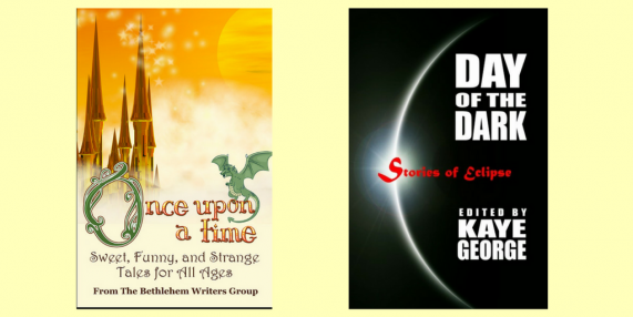
These two covers elicit very different first impressions. The former (Once Upon a Time) is colorful, magical, and a bit whimsical. The font has a fairy tale feel. One would not have any qualms about picking it up and handing it to a child to leaf through. It invites children and adults into a world of imagination.
The latter cover (Day of the Dark) is mysterious, and bit foreboding. Looking at this cover, you would not expect it to be the reminiscences of people who have viewed an actual eclipse, despite its title. No—this cover tells us these stories are apt to be a bit darker. The color and font used for the subtitle, Stories of Eclipse, reinforces that impression. This book doesn’t reach out to a children’s audience the way the castle and happy dragon do on Once Upon a Time.
The same is true for books within the same genre. My new mystery, Death in Glenville Falls, has a cover that should tell you something about what might lie behind it:
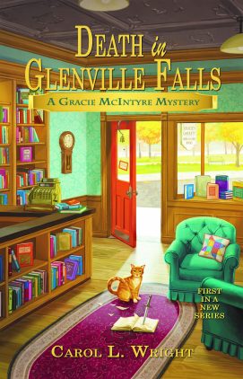
The colors are warm and inviting, and the scene charming. There’s even a cat. This idyllic scene might make you think of Jan Karon’s Mitford series. But there is clearly a sinister element afoot, for what foul force would result in the stabbed book in the foreground? This cover tells you that there is a mystery inside, but it falls within the traditional/cozy side of the genre. It might keep you up at night because you want to keep reading, but it probably won’t give you nightmares.
On the other hand, my friend Geoffrey Mehl has a book, Nine Lives, that also falls within the mystery genre. With a title like that, it could be the story of the cat on the cover of my mystery, but his cover looks like this:
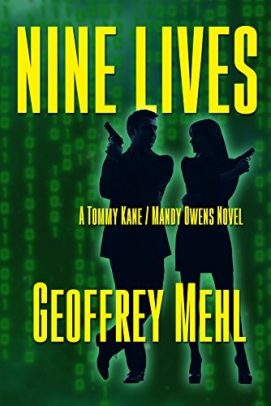
The sinister element is certainly there—silhouettes of people holding guns—but none of the reassuring, small-town charm balances it. Instead, we see computer code streaming behind them. This is clearly an edgier, suspense novel—and probably one having to do with computer data.
The same can be true, even for books with similar titles—only the cover tells us whether it’s one we’ll want to pick up and read more about or not. Take, for example, the books The Vampire’s Prisoner and Vampire King. Both titles suggest a powerful vampire is at work within the pages of the novel, but the covers give very different impressions. Look at:
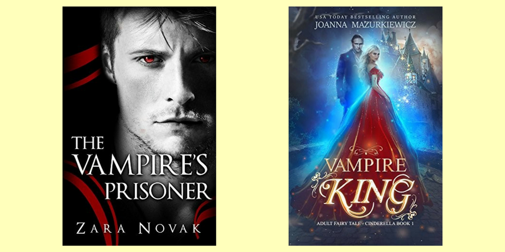
The two offer very different kinds of chills.
Selecting a cover is often solely left to the discretion of the publisher, but for independent or hybrid publishers, authors have more control over how their books will look. It’s important to bear in mind that the cover image and cover design are truly the potential reader’s first impression of your work. If the cover looks amateurish, the assumption will be that the contents are, too. If, however, your cover grabs the readers’ curiosity, they are more apt to pick up the book, turn it over, and read more about it. If the back cover copy confirms what the cover promises, they might then turn to read the first page. And if they like what they see there, you might well have made a sale.
And all because they have judged your book by its cover.
Carol
 Carol L. Wright is a former book editor, domestic relations attorney, and adjunct professor. She is the author of articles and one book on law-related subjects. Now focused on fiction, she has several short stories in literary journals and award-winning anthologies. Death in Glenville Falls is her first novel.
She is a founding member of the Bethlehem Writers Group, LLC, is a life member of both Sisters in Crime and the Jane Austen Society of North America, and a member of SinC Guppies, PennWriters, and the Greater Lehigh Valley Writers Group.
Raised in Massachusetts, she is married to her college sweetheart. They now live in the Lehigh Valley of Pennsylvania with their rescue dog, Mr. Darcy, and a clowder of cats—including one named Dickens.
You can follow her Facebook page or learn more on her website.
Cover review: Half ‘n’ Half Covers
May 8, 2017 by H. O. Charles in category Art, Cover, Design by H. O. Charles tagged as art, book covers, covers, design, graphic designMy eye was caught this month by these rather attractive, bipartite covers in the Thriller section:
![He Said/She Said: the Sunday Times bestseller by [Kelly, Erin]](https://i0.wp.com/images-eu.ssl-images-amazon.com/images/I/513IiOz2Y8L.jpg?resize=198%2C305&ssl=1)
![My Husband the Stranger: An emotional page-turner with a shocking twist you'll never see coming by [Done, Rebecca]](https://i0.wp.com/images-eu.ssl-images-amazon.com/images/I/511IFByEhSL.jpg?resize=201%2C308&ssl=1)
![Two Sisters: A gripping psychological thriller with a shocking twist by [Wilkinson, Kerry]](https://i0.wp.com/images-eu.ssl-images-amazon.com/images/I/51xNGKEcpxL.jpg?resize=195%2C307&ssl=1)
What I really like about these three covers is the way they separate their titles into two halves using both contrasting colours and placement inside the background imagery.
Not only does this make a striking image, it also communicates the essence of the titles before the reader so much as thinks about the meaning of the words within them.
They tell you that there are two stories to be told, two points of view – a this and a that. Of course, the real world is not always so simple, and the stories within may not be either, but our human brain likes things to be reduced to simple statements, which is exactly what these covers are.
The great thing about this type of cover design is that it can be applied to so many novels, especially in something like the crime/thriller genre, where there is a question of innocence/guilt, or was it him/her? etc.
But the title has to work with the design. “He Said/She Said” is easy to balance and mirror, as is “My Husband the Stranger”. With “Two Sisters”, however, the designer has to forget the idea of perfect symmetry, and tie the words instead to background images that balance them out. Even though the words are different sizes, you are still left with the impression that they represent two individuals, who are likely quite contrasting in character, standing in that landscape.
So there you go – another design route to consider for your next novel!
I thought I’d also include a couple of “cover picks of the month” this time round, because they were so pretty (and tie in with what I was nattering on about last month re: minimalist titles and their covers)
![Kin: Helga Finnsdottir Book I by [Kristjansson, Snorri]](https://i0.wp.com/images-eu.ssl-images-amazon.com/images/I/519Utc%2B99CL.jpg?resize=194%2C304&ssl=1)
![Once Cold (A Riley Paige Mystery-Book 8) by [Pierce, Blake]](https://i0.wp.com/images-eu.ssl-images-amazon.com/images/I/41f-bTMCGbL.jpg?resize=196%2C295&ssl=1)
Aren’t they pretty? And also slightly spooky?!
 H.O .Charles, a cover designer and author, was born in Northern England, but now resides in a beige house in Suffolk.
Charles has spent many years at various academic institutions, and really ought to get on with writing a PhD, but frequently becomes distracted by writing fantasy fiction instead.
Hobbies include being in the sea, being by the sea and eating things that come out of the sea.
Cover designs: www.hadleighdesign.blogspot.com
Author: www.hocharles.com
3 0 Read moreWhy Cover Designers Want Your Title to Be as Short as Possible (unlike this one)
April 8, 2017 by H. O. Charles in category Art, Cover, Design by H. O. Charles tagged as art, covers, designI’ll let you into a little secret: wordy titles (and also looong author names, if I’m honest) are HARD WORK for a cover designer. Really, we should be charging extra for them. Perhaps £10 extra per letter for any word more than one syllable long would be sufficient. The Curious Incident of the Dog in the Night-Time would have netted me £380 before I’d even started doing any art…
* laughs dreamily *
I joke, of course, but if you are into art and design, and you recognise that a reader will judge a cover before they judge a title, then you might start to see how less is more…
Here’s a worked example (very hastily put together, I should add), but hopefully it will show you how a short title (and even author name) can help you achieve that impactful, minimalist look.
The first cover is simple, no-fuss and easy to read. The text doesn’t have to be huge, and I can keep everything neatly squared.

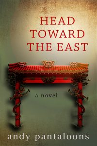
If I want to go for a really modern approach, I can blur out the background entirely, which gives the title text much more weight, and gives me the freedom move the author name about. I can even play with light. Of course, this would work better with a more recognisable image than a Chinese archway, but you get the general idea…

Then we have a longer author name. The colours I can use for it are now more limited if I want it to remain legible, and it needs balancing out with some text at the bottom. Still, it looks fine because the most important piece of text (the title in this case – Andy Pantaloons is not that famous) is short.

Things are getting tricky with this longer title! At this point, I would usually change the font and tweak the letter spacings to see if it would look better, but for the purposes of explaining the impact of title length, I’ve left it the same. It’s still just about okay, but if the author wants more images, the chances are they will fight for attention with the text.
Time to pack my bag and go home! What a mess! There is just too much image for a title that size, and so I would either consider getting rid of the arch altogether, or throwing my laptop against the wall.

Of course, it is down to the designer to take whatever title you throw at them and make it look good, and we have a tonne of tricks for doing that, but if you like the minimalist look, and you want your cover to appear modern, AND there is an idea you want to convey in pictures, then consider a short title paired with a single, powerful image. This is one of my favourite examples from another designer (Eric White):

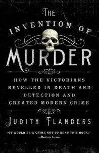
All of that said, here’s how a long title can look good. This cover is by Ervin Serrano, who did a brilliant job with the “The Invention of Murder: How the Victorians Revelled in Death and Detection and Created Modern Crime” but you can see how he had to sacrifice images (almost) altogether in order to make the overall design work and remain clear.
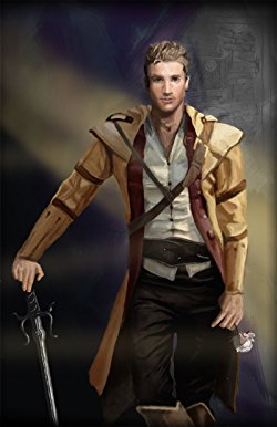
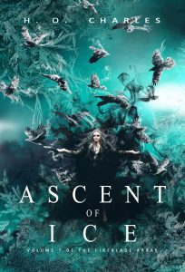
And of course, certain genres *demand* busy artwork, so I’ll neatly lever my most recent fantasy cover design in here, and thank you for reading!
H.O .Charles, a cover designer and author, was born in Northern England, but now resides in a beige house in Suffolk.
Charles has spent many years at various academic institutions, and really ought to get on with writing a PhD, but frequently becomes distracted by writing fantasy fiction instead.
Hobbies include being in the sea, being by the sea and eating things that come out of the sea.
Cover designs: www.hadleighdesign.blogspot.com
Author: www.hocharles.com
2 0 Read moreCOVER YOUR ASSETS
August 15, 2013 by A Slice of Orange in category Archives tagged as artists, covers, graphic artists
 |
| My most recent cover with Caitlin |
Featured Books
MY SOUL TO KEEP
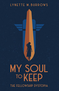
Miranda has three days until she must surrender control of her own life forever.
More info →


THE CHRISTMAS WISH
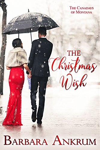
Will Eve find it’s possible that Christmas wishes aren’t only for little girls?
More info →
NAMES I CALL MY SISTER
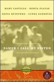
Four stories of sisterhood—the bonds, the wars, the frustrations, the love—seasoned with hot Latin spice!
More info →

HAGAR’S LAST DANCE
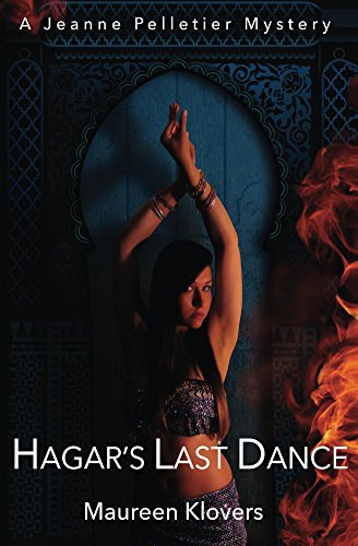
By day, Jeanne Pelletier is a small-town girl toiling in obscurity at a stuffy Washington, D.C., law firm; by night, she’s Zahira, the city’s newest belly dancing sensation.
More info →